On Land

Environment Information
At Rill & Decker Architects we run ArchiCAD on Mac OS X. If you work at Rill & Decker, this is your stuff. If you don't, but you work in ArchiCAD, you may find something interesting. Anybody else, I don't know.
RSS
Theory Archive
Too Many Things
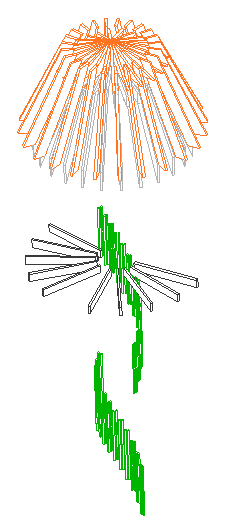
Kinda looks like a jellyfish
This image shows a few isolated elements from a lighthouse-looking tower structure. The 54 columns are balusters for the stair railing. The 110 objects are wood beams for the roof framing.

By themselves, it's not a lot of elements, or even a lot of polygons.

Yet these guys were found to be the cause of a severe and mysterious performance problem. An elevation containing the tower, which should generate in about 30 seconds, took four minutes to generate with these elements in the model.

The problem: AC has to figure out what's in front of what behind what in front of what, for all those overlapping elements. The calculations quickly become very complex and it takes time.

Here's the tricky part: The columns and objects weren't even visible in the elevation; they weren't going to be drawn at all. But apparently there's no way for AC to know that in advance, so you have to wait an extra 2-4 minutes for every section/elevation to generate.

It was hard to figure out, which took some time, but I'm afraid to wonder how much time was wasted over the weeks since those elements were put in.

BTW, it's not my project.

How I figured it out. I tried tearing out all the old objects, resolving the intermittent report errors, doing a forward merge, and opening the project as a dummy user, none of which worked.

There was a clue in the progress dialog as the elevations generated, but it took me a while to recognize it as such. The progress bar would hang up on 'Processing Objects' and 'Processing Columns'. The objects clue isn't much of a clue; of course there's a lot of objects. Hanging on columns is weirder, so weird that I figured it was a glitch; that was a mistake.

I still suspected mystical corruption, and it's my superstitious belief that corruption develops over time, so I tried deleting the whole first phase of the model, which is not in the current scope of work. (I used a heavy marquee for this.) That worked. I undid the delete.

Then I noticed the tower. I thought such a contraption probably has some funky geometry. I deleted the tower only, and that worked. Then I switched to the thin marquee and tried deleting one story at a time. This was disappointingly ineffective. Now I know that the reason is that the complexity was spread over several stories.

But when I trashed the top story, with all the beam objects, the 'Processing Objects' delay went away, leaving only the 'Columns' delay. I finally realize that the progress dialog wasn't totally off base. If losing objects helps, then we should look for some columns to lose. I did a select-all-columns within the marquee on each story, which finally coughed up the balusters.

Delete. End of slowness.

Tips:

• If you've ruled out file corruption, you need to look for 'heavy' conditions in the model itself.

• If you just did some weird complex modeling and suddenly it slows down, that's a big hint.

• You can tear the model in half and throw it away. Undo is your friend. Saving as is your friend. Start trashing stuff and see if the problem goes away. You can do a similar test by turning off half the layers, then the other half, etc.

• Watch the progress dialog. If it spends a long time on 'Objects' or 'Columns' or whatever, or the time estimate shoots up at a certain stage, that's a clue.

I thought we were supposed to model everything.

This is a good time to review this. We don't 'model everything'. We model what it is efficient to model, which, for a skilled ACer, is a lot of stuff. You model the major pieces of the project. You model stuff that shows up in a lot of views. You model enough to really understand the building. You model enough that annotations can be added easily.

You have to work within your own abilities and within the power of AC on your machine.

I hope it's obvious that you don't model things that cause AC to bog down and start wasting your time. We don't model joists, individual rafters, or other generic framing. Too much work for us, and, it turns out, for AC.

In the tower, some of the framing was intended to be exposed, but most of it was 'architecturally' insignificant and should have been skipped. The balusters are definitely nice to model, but there are situations where you need to compromise to keep the model running smoothly.

Maybe the tower section should be a drawing, or maybe a drawing elevation of the balusters should be pasted into the model SE window. Maybe the balusters should be on a layer that only shows in 3D views and not in section/elevation. That kind of lateral thinking.

Something to think about, or maybe not. Not all objects have to be right in every way.

Plan symbol
Plan symbol on remote stories
3D hidden line
3D shaded
3D render
Elevation
Elevation in distant area
Section
Polygon efficiency
Scale sensitivity; which compounds the plan symbol, section, and polygon issues
Listing
Labeling
User interface
Parameter list
Parameter transfer management (Unique parameters)
2D graphical editing
3D graphical editing
Selectability
Code maintainability
Intra-library consistency

A frequently used, complicated, widely viewable object, such as a window, needs to be right in virtually every way.

The development environment gives very poor support for many of these requirements. As ArchiCAD adds features, items are added to this list. Irritatingly, the environment has not kept up, and is way overdue for a tear-down. There is no section window, no remote stories, no graphical editing. The full features of the current GDL architecture are not supported, so we can't even imagine modern development features such as syntax coloring and auto-completion.

One of those things that bothers some people more than others.

I inherited a project where an important dimension was supposed to be 12'-9" and instead it was established as 12'-9 9/64". The fraction rounds to 1/8", which resolves in the dimensions (12'-9 1/8"), so I have to fix it or customize the dim text, which would violate various Prime Directives.

And it's my fault I didn't catch it before adding all the pretty bits, which now have to be dragged and stretched by 9/64". But the point is that a project shouldn't leave schematics which such imprecisions.

It's just as easy easier to build precisely: Start, shift or guideline, 'R', value, done.

It doesn't mean you can't be sketchy in AC. Just rationalize the measurements before/as you go to DD. Even if you're not doing the CDs, be considerate of your colleagues and tighten up the model before it gets crazy-complex.

It is much more comfortable to work in a model that is precisely done. The mind becomes accustomed to seeing the nice round fractions, so when there is an ugly number, it gets your attention.

Eighths in dimensions at 1/4" scale make us look silly to the builder, except in rare circumstances. Unless you're talking about a funny angle, 1/8" has no effect on the design, and it will be ignored, unless chuckled at.

And no, you can't change the dimension standard to 1/4", because if your model is sloppy, the sloppiness will manifest as rounding errors rather than random eighths.

If the model is precise, the dims will take care of themselves, and you will have more time for other things.

So please model precisely, from the beginning. Banish all but the specialest eighths, and most of the quarters. Halves are OK... big and almost round.

One more thing. When you have 9/64" in a measurement, it's your fault. AC does not make these mistakes by itself, at least not as near the origin as we work. No mystery, just fix it and move on to something more interesting.

Location: 06 Wood & Plastic / Railings & Stairs (I'm thinking about moving it, since it's not really a fine detail-type thing any more. More like a missing tool thing. Not to mention, it could be concrete. I really wish the object browser could handle aliases. As for now, there it lies.)

UPDATE: Stair Body JM9a is exactly like Stair Body JM9, but I added the story-sensitivity behavior from Railing JAM9. See below.

In honor of the story cuts, I also added an integrated cutline. It is simplified, and it still doesn't mask, but I'm working on that.

I also (now how much would you pay) added a Cover Fill Pen parameter, which simply allows the object to be opaque.

All this is identical to the JM9 post otherwise.

(Teaser futuristic update-to-be: I am already mostly done with Stair Body JM10, believe it or not. The big deal there is intelligent interaction with the new Floor Plan Cut Plane. Pretty cool.)

A very basic (in a good way) flight of stairs. An incremental improvement on Stair Stringer JAM8. You can still use it as a stringer; just make it thin. I changed the name because I use it more often for actual stairs.

Sidebar: There's a stair tool (Technically, the StairMaker add-on), which you should never use. Then there's ArchiStair by the very capable and friendly Cigraph, which is like a good StairMaker, only better.

I recently used an ArchiStair spiral stair for which I was very grateful, but generally I am skeptical of full-service add-ons for highly detailed building parts. No matter how many options, configurations, and details are offered, you will soon run into a custom situation where the add-on doesn't quite make it.

I would rather have more, simpler, separate elements. (Well, no, I would rather have one element do everything by magic, but it's not realistic.) If you run into a freaky custom railing, you can focus on that without wrecking the whole stair. And: In design development, you can show just a simple stair, leaving the details for later, where they (the details) belong.

This is consistent with a general principle of ArchiCAD's design, our workflow, and how projects are actually built. Big, chunky stuff comes first: Walls, slabs, roofs, the basic geometry of stairs. Fine detail comes later, and is applied to the big stuff: Trim, finish floors, newels and railings.

So: The Stair Body object is like a slab tool for stairs.

Another major basic-yet-detailed building part is the chimney. See what I mean? End sidebar.

Now we can talk about the object.

More»

Accuracy is first. Completeness is second.

We're talking about construction documents of course.

The end product of our work is a building. The documents are the primary device for ensuring the building is executed in accordance with our design intent. Therefore, in evaluating the quality of documents, we are really talking about their reliability. Using these documents, how close to the design intent can the builder get? How much extra effort will be needed on the part of the builder, or ourselves, to clarify the design intent?

So the most critical value is accuracy. If information is in the documents, it needs to be correct. There is no way to tell accurate and inaccurate information apart. If information is missing, the builder will need to ask for it. Better to be missing than wrong.

A corollary of accuracy is consistency. If information is repeated in the documents, the repetitions need to be accurate. Since changes + repetitions = maintenance, repetitions should be kept to a minimum. Remember unity.

Assuming all the information in the documents is accurate, there should be as much of it as possible. The second most critical value is completeness. While we want the builders to call if information is missing, we don't actually want them to call. The challenge is to maintain accuracy while improving completeness. Especially when under deadline, accuracy is at risk when you focus on completeness. Remember, as you are wondering how you will ever "finish", that accuracy is more important than completeness. It is dangerous to "just get something on the drawings," because once it's there it's easy for us to forget it's not accurate, complete-looking as it is. If you don't have time to do it accurately, leave it out, let them call.

Right, so you don't have enough time. This is bad news for the aesthetic enhancement of the CDs. You can't invest time in making the drawings more pleasing to the eye if they aren't complete and accurate. So beauty is third, and lots of times you won't get to do as much of it as you'd like.

Hey, it's not last. Last is probably 'use of whitespace' or something. Having kicked beauty most of the way off the train, now I'll give it a hand up.

Beauty should be considered in standards, since that way it can be automated. If a standard is set, a beautiful solution is no more expensive than a plain one.

And listen, we're talking specifically about technical construction documents, not the building, materials, presentation drawings, competition entry, finish selections, or conceptual solution.

There are six.

Impossible: Literally. Not a slang term for "very hard". Some people will say that nothing is impossible. This is obviously not true.

Somebody: Nothing is impossible!

Me: Can you walk to the moon?

Somebody: Of course not!

Hard: Possible with effort, time, concentration, creativity, energy. Example: Flying to the moon.

Tedious: Requiring time and energy, but not creativity. Example: Flying to Florida.

Easy: Nearly effortless. Apparently requiring little time or energy, yet accomplishing a lot. Example: Calling Florida on the phone.

Automatic: Effortless. Takes care of itself without attention. Example: Answering machine.

Invisible: Out of one's hards. Forgotten. Examples: Eyesight, digestion, electricity, democracy.

Individual skill development, and technological progress, means pushing tasks down this scale. Advances in knowledge make the impossible merely hard. With further development and practice, hard tasks become tedious. Tedious work is speeded up and becomes easy. Easy work becomes easier and easier until it's no longer work, it's automatic. Automatic tasks are forgotten and become invisible, as we focus our energy on the hard and tedious work we still have.

This leads to some aphorisms:

From a workflow standpoint, inefficiency comes from not knowing the degree of difficulty of a task. If you overrate the difficulty of a task, you're doing it the "hard way". The worst case is to mistake a hard job for impossible, and not try at all. On the other hand, if you underrate a task's difficulty, it probably won't end up done right. For example, if you think something tedious is easy, you won't dedicate the required time to it.

Getting from impossible to hard often depends on external developments. The impossible needs to revisited occasionally, to see if other developments have moved the task to hard. You can't make vaccines until you know about the immune system.

Working on the impossible without expecting it to be accomplished grows knowledge that might be useful later.

Don't mistake your own fear of difficulty for impossibility. Don't mistake your own impatience with tedium for difficulty. Visualize non-impossible stuff getting easier.

It is hard to determine if a task is hard or impossible.

Automatic and invisible tasks need to be periodically looked in on.

That is all.

Build it like they build it except when you can’t.

Stay organized. Be consistent.

Don’t draw anything you can model.

Do everything as needed. Meet the demands of the current situation. If you can’t see it, put it off.

Throw down an element, then fix it.

Fix the mistake when you see it. Fix the whole mistake. Find & Select.

Print. Color is misleading. Your eyes and monitor are only so good.

A single building element, how about a window, will be represented multiple times in the construction documents.

There's the window in a plan, at least one elevation, often two or more sections, maybe/probably an interior elevation, maybe a wall section, and the window schedule. Then there are dimensions and annotations related to the window. Five to fifteen representations of one element is probably typical.

The goal is to generate these representations with as few project elements as possible. The ideal is one. With a one-to-one ratio of project elements to building elements, you can focus on manipulation of an element, knowing the representations will largely take care of themselves.

With multiple project elements per building element, it falls to you to maintain the integrity of each and every representation. You work more, do the same things over and over, have less fun, and make more mistakes, which, considering how hard you've been working, is a downer.

When you choose to draw a building element that could be modeled, you are shifting the responsibility for the representation of that element away from the software and onto yourself. When you unlink a section/elevation, you are signing on to change that one door or window multiple times. As multiple building elements change multiple times, the added work, and the risk of error, grows exponentially.

This ideal of of unity is only partially attainable with current technology. But you should have a good grasp of how attainable it is.

For example, full-height walls are relatively unified. They display well, automatically, in a wide variety of contexts. Low walls, however, are less unified: Since the plan and section fills can't differ, you need two elements, a wall and a slab, for the the plan and the section. (Update: In 10 this is somewhat improved. You can show a top view of a wall, but you can't control the fill.)

The reflected ceiling plan is a great divider. Many elements need to be drawn over. Beams, dashed in plan, need to drawn solid, while floor elements, solid in plan, need to be drawn dashed. Given the current design of the software, we're stuck with this.

A lot a higher-level object design is concerned with getting objects to multi-represent themselves better.

Our job as users is to know these limits, do our best within them, and work around them when we can. If you can cut the number of project elements for a building part from 5 to 3, do it. Reduce repetition where it can't be eliminated.

Part of knowing the limits is noticing when they change. It's important to stay informed about developments in technology which can lessen repetition. This includes improvements in software and in our own libraries and standards. This, in turn, means a willingness to change our habits, abandon obsolete workarounds, and adopt better techniques.

These are the primary functions of layering, in order of importance:

1. Control of display for output. The finished output has to show and hide the right elements.

2. Control of display for working on the project. Showing and hiding elements depending on the work you are doing at the moment.

3. Promotion of logical thinking about the project as a building rather than as a bunch of drawings.

4. Protection of elements used for reference. For example, the walls are locked when working on the structure plans.

Layers exist so elements can be shown, hidden, and locked as needed. Beyond that, layering helps keep the project straight in our minds as we work on it. To this end, layers should be:

Sensible. An architect using an architecture-oriented CAD program should expect to find a layer for "Walls". They would also expect a layer for fireplaces, even though walls and fireplaces display together and don't technically need separate layers. "Put the fireplace on the wall layer" doesn't sound right. In keeping with Virtual Building principles, our layers relate to building parts first, and annotations or drawing types second.

Truthful. I recently added a layer, S Deck, for floor-structure slabs. Previously, we used S Slab. I decided it was poor thinking to call joist decks and concrete slabs by the same name. Layers should encourage clear thinking about the building itself.

Logically Consistent. A stair will be made of elements which display in plan and elements which are 3D-only. So we have two layers, A Stair2 and A Stair3. This arrangement should apply to all assemblies which are split between plan and 3D, such as soffits.

Here's another way of looking at it:

In the design of ArchiCAD, the floor plan is the "main" window. Close it and you close the file. Every element must be on a story, and therefore visible in the plan window at some point. (Even though you can place elements in 3D.)

The first function of layering is to separate the Plan- and 3D-only elements. If we only did architectural drawings, we could get by with just those two layers, Plan and 3D. We would have two layer combinations, Plan, showing only the plan layer, and 3D, showing both layers. This setup meets the minimal display requirement above.

But it would be very difficult to work with. Productivity would suffer as the user went insane. So within the architectural, we have lots of plan layers and lots of 3D layers, which correspond to building parts. In the plan we have walls, cabinets, fixtures, etc. In 3D we have floors, structure, trim, etc. The addition of these layers doesn't advance the display requirement at all, it just helps us stay sane.

It helps our work to have layout and guide elements. Those need layers, since they have to be hidden for output. It's convenient to be able to "permanently" hide elements without deleting them, trashcan-style. It's handy to keep area-measurement fills in the project, but we don't look at them very often. So there are several kinds of administrative layers that don't directly represent the project or the output.

Then there's the invisible modeling tools, cutting roofs and SEO operators.

Once we get into other drawing types, structure plans, etc., those drawings have their own annotations, and require different architectural elements to be shown and hidden. The structure plans require that the landscape walls (hide) be separated from the architectural walls (show). The reflected ceiling plan requires that the crown moulding (show) be separated from the other high trim (hide). If you have two site plans, you need layers for each of their annotations, and for the annotations they share.

The layer setup we have is the product of a years of refinement along these principles. When we add a layer, it should be in order to improve the logic of the system or to facilitate a new/better mode of work. For example, to model wall sections, the crown needs to be positioned taking the ceiling finish into account, and the ceiling finish itself needs to be modeled. But since the ceiling finish is only useful for wall sections, we don't take the time to build it everywhere. Since it stops and starts, it needs to be hidden in building sections so we don't have jaggy ceiling lines. Therefore we need the layer F Clg Fin, as well as layer combinations for wall sections separate from building sections.

I hope this helps answer the question, "Why are there so many layers?"

There's lots of good reasons to invest the time needed to work the model out. It helps you understand the design, find massing problems, catch tricky details, and get lots of drawings started at once.

Lately we've noticed an advantage that is distinct from these, but related. With a well-developed model, we are less vulnerable to construction errors arising from incomplete annotations.

When we leave off a knee wall height dimension, and they call and ask for it, we can go to the model and measure it. If there's a building section showing the knee wall, and the section is a model view, we can scale the wall and be confident that the relationship between the wall and the roof is correct. Now, don't tell the builder this; the prohibition on scaling to determine dimensions remains. But we're allowed to "scale" the drawings if we know the model is worked out.

Builders are invariably amazed that the ridge elevation ends up within an inch of where we said it would be, on a crazy roof with a bunch of different slopes. We would be amazed if it didn't.

Even if there are annotations missing, there is reliable data in the model. Of course, we should strive to make the annotations as perfect as possible as well. But it is better to have incomplete annotation of reliable geometry, than finished annotation of a model that doesn't actually work.

In the future, buildings will be engineered and documented exclusively using virtual modeling techniques. The near future.

The term 'model' is being used in two ways: To pretend to build, as with clay or Legos. To simulate using math, logic, and rules, as with climate modeling.

Carry this further, and we see that the virtual building model contains two types of information: Polygons, the stuff the building pretends to be made of, and descriptions, the words and numbers about the stuff the the building is made of in reality.

This is instantly recognizable as the ancient duality of architectural documentation: pictures and specifications. Show what it should look like, add descriptions for clarity and emphasis.

We model geometry, which ends up as drawings. We model information, which ends up as specifications.

The geometric, polygon model allows/forces us to check the consistency of the geometry. Things have to fit. It discourages pretending. You can move the polygons now, or the concrete later.

Working out the geometry is hard work. But it is the exact same work builders have always done, now orders of magnitude less expensive. The responsibility of designers to understand the geometry has not changed. The tools have made this understanding a hundred times more attainable.

With the geometry in place, the simulation model gives us for free the ability to maintain the integrity of the information.

Ideally, we would draw/describe every single thing in the project, and point to the drawings/descriptions from every conceivable point of view. In reality, the maintenance of describing every single thing in every conceivable context becomes prohibitive. Changes are incompletely deployed, and you have inconsistency as well as errors of commission, i.e., mistakes. This is worse than what you were trying to avoid: errors of omission, where things aren't called out enough.

The virtual building enforces consistency. It enforces it by moving one window and affecting multiple views. It enforces it by letting you draw a detail once and call it out indefinitely.

As you zoom in in scale, less information is modeled, and more is drawn and described. Details will be drawn for the foreseeable future. This does not mean they're 'not modeled' and therefore substandard. They are drawn within the system of the virtual building, drawn once and called out repeatedly. Drawn accurately, so their geometry is checked, even in 2D. In this way, they are part of the model as simulation.

The important thing is for the professional, you, as you 'draw', to maintain the integrity of the model, in the software and in your mind. It is permissible and necessary to draw, but you must know exactly how that drawing relates to the model, and be able connect the drawing to the model, and maintain the connection. It is the maintenance, again, that is expensive. When you 'just draw it', you are sacrificing integrity, risking error, and making your job harder.

Buildings are incredibly complicated. The paradigm of our time is to say of complicated things, "They contain a lot of information." Without a computer, managing a lot information requires a lot of energy, which means people and money. With a computer, managing a lot of information is only slightly more costly than managing a little.

Cars and airplanes, which are much more complicated than buildings, have been designed digitally for some time. This shows clearly that the slowness of adoption in the building industry is due to culture, not technology. People are coming to realize that a complete building simulation is an extremely valuable document. It helps everyone: Architects, clients, engineers, tradespeople, facilities managers.

The virtual building idea is nearing a tipping point, where suddenly the next day it will be everywhere, like the web, or cars, or airplanes. We are lucky to be in the forefront of this movement; the late-adopters will be looking for work. Technological revolutions have a way of putting the leaders in the middle of the pack. We must continue to push forward, because things are about to start moving very fast.