Caption Text
« Newer | All Entries | 1 | 2

There's lots of good reasons to invest the time needed to work the model out. It helps you understand the design, find massing problems, catch tricky details, and get lots of drawings started at once.
Lately we've noticed an advantage that is distinct from these, but related. With a well-developed model, we are less vulnerable to construction errors arising from incomplete annotations.
When we leave off a knee wall height dimension, and they call and ask for it, we can go to the model and measure it. If there's a building section showing the knee wall, and the section is a model view, we can scale the wall and be confident that the relationship between the wall and the roof is correct. Now, don't tell the builder this; the prohibition on scaling to determine dimensions remains. But we're allowed to "scale" the drawings if we know the model is worked out.
Builders are invariably amazed that the ridge elevation ends up within an inch of where we said it would be, on a crazy roof with a bunch of different slopes. We would be amazed if it didn't.
Even if there are annotations missing, there is reliable data in the model. Of course, we should strive to make the annotations as perfect as possible as well. But it is better to have incomplete annotation of reliable geometry, than finished annotation of a model that doesn't actually work.
Gravity allows you to "set" elements on top of other elements. Instead of manually setting a Z height, the element will be placed at the top elevation of a slab, roof, or mesh, at the clicked point.
These elements can be placed using gravity: Wall, Column, Beam, Object, Lamp, Level Dimension.
I works in plan and in the 3D window.
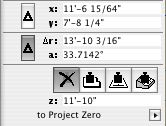
You tell ArchiCAD what type of element to set on by using the gravity buttons in the Coordinate Box:

You can scroll thru the buttons by typing V.
If more than one of the target element type is present at a given point (e.g., floor, counter, and ceiling slabs), the placed element will be set on top of the topmost element. Elements on stories above will be detected too. In order to get gravity to detect lower elements, you can hide the layers of the elements that are "in the way." (Don't forget the Quick Layers palette.)
Tip: Watch the Z field of the Coordinate Box. It will display the elevation that gravity is using at a given point, so you can see if the element is going to be dropped at the right height.
In practice, I only gravity for a couple of things. It's not convenient to use it to place toilets, for example, since they have to sit on the finish floor, and the toilet usually goes in before the finish floor slab. Since gravity always responds to the topmost target element, it takes some planning and care, and it isn't as natural as it could be.
It's very useful for placing 3D trees on a mesh. No matter where you click, you know the tree is going sit on the mesh, and you don't need to know the height.
It's indispensable for associated Level Dimensions.
Composites allow you to show multiple cut fills in a wall, slab, or roof. I can think of three reasons to use them.
• To display multiple fills. Example: Masonry veneer on a stud wall. This is the most obvious, and probably original, reason to have them. Ironically, such composites don't work at all unless you've made your own windows to handle the masonry openings correctly, which we have.
• To model a wall at one thickness while dimensioning the wall to another. Example: 2x4 with drywall. The wall is 4 1/2" inches thick to match reality, and to properly interact with trim elements. We dimension only the stud portion of the wall. More on the particulars of this below.
• To have elements "break down" nicely when turning a section into a drawing. Example: A joist deck. The deck composite has a skin for sheathing on top of a thick skin of the joist depth. The skins are the same fill, so the slab will appear homogeneous. When the section is unlinked, it's easy to turn the top (sheathing) fill into plywood. Since composites don't have scale-sensitive fills, this is the next best thing.
Composite setup
• Edit composites at Options -> Attribute Settings -> Composites.
• Composites can 'force' skin attributes onto elements. Instead of setting each wall to have particular pens for background color, skin lines, etc., you can set elements to use the attributes defined in the composite. Generally, I think this is a good idea, on the principle that you should control more stuff with fewer clicks. Further,
• There is a special case where you have to use the settings of the composite: To completely hide a skin separator line. This option isn't available in the element settings. For drywall partitions, you have to treat the interior separator lines in this way.
• The background colors, fill pens, contour pens, and separator pens can be applied from the composite independently. If you want a wall to be blue for some reason, you can change the contour (cut) pen while retaining the background color of the composite.
• You can limit the use of a composite to the wall, slab, and/or roof tools.
• For wall composites, the reference line is at the top.
• As with any attribute, you can use Attribute Manager to pull composites from other projects.
Case study, dimensioning stud walls
• In the setup of the composite, the checkboxes on the left allow you to designate skins as "Core". You can have multiple core skins, but they must be adjacent. What's core? Well,
• In the dimension tool settings, there is a checkbox, "Dimension Core Only of Composite Walls." So,
• The composite 'Wall 2x4 DW' has only the 3 1/2" center skin set to core. When dimensioning, click on the edge of the wall. (Don't hunt for corners!) This results in two ticks on the core, not the outside, of the wall. The wall is built at 4 1/2", and dimensions 3 1/2". Perfect.
• Summary of why this composite set up the way it is: It's 4 1/2" inches overall, because that's how thick walls are in real life, and it's impossible to pretend otherwise and still get the trim modeled correctly. It's three skins; 3 1/2" in the middle, set to core, so we can dimension to the framing. The three skins are all the same fill, so the walls clean up to the slabs in section. (The slabs are all the same fill too.) The separator lines are hidden in the composite settings, so the walls clean up to each other in plan.
« Newer | All Entries | 1 | 2