On Land

Environment Information
At Rill & Decker Architects we run ArchiCAD on Mac OS X. If you work at Rill & Decker, this is your stuff. If you don't, but you work in ArchiCAD, you may find something interesting. Anybody else, I don't know.
RSS
March 2005 Archive

All Entries | 1 | 2 | 3 | 4 | Older »

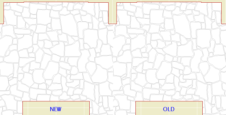
I redrew the "Flagstone Random" fill pattern, in an attempt to get it to redraw faster in vectorial. I cut the number of lines by about 50%. There are now only 1700 lines in a 10' x 6' rectangle.

It's a little faster. Not as much as I expected, but every little bit yada yada.

If you want to try it, you can pull it from the Vassos project using Attribute Manager. Here's the before and after:


I think the new one looks better too.

If no one complains I will replace the fill in the templates in a little while.

Location: 06 Wood & Plastic : Brackets

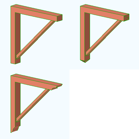
An Arts & Crafts type bracket. Parameters: Length, height, width, top/bottom thickness, top/bottom end treatment, strut thickness, width, and top/bottom inset.

The end treatments are Square, Ogee, and Pyramid.

You can turn on "Both Ends Same" to use the same values for the top and bottom. In this case, the bottom-related parameters are hidden.

Most of the parameters are editable in 3D.


Location: 03 Concrete

The main parameters are the height, width, and thickness.

By default, the overlap matches the thickness, and the tread is double the thickness. To change either value, set the parameters to other than zero.

The length of the object cannot be controlled. The idea is to let the object tell how much length is needed to step up the required height. The resulting length is the distance between the adjacent slabs. The length is shown, locked, in the length field.

The object "starts" at the bottom. When the length changes, the top end moves.

The top of the object will match the top elevation of the upper slab footing. The bottom, it depends:

If meeting the lower footing "in line", the bottom elevation should match the top of the lower slab, and the "Bottom Lap Segment" should be on. If meeting the lower slab at a "T", the bottom of the object should match the bottom of the slab, and the lap segment should be off. I think the second case is more typical, and is shown in the image below.

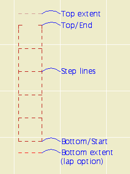
The "length" rectangle is shown with the floor plan pen of the object. The adjacent slabs should meet the ends of this rectangle. The red line indicates the bottom of the object, and the extent of the Bottom Lap Segment, if on. The light pink line shows the physical extent of the object at the top. Both these lines print white. The lines in between represent the elevation changes (steps).


In plan.

Placement: The object should be drawn with a dashed line. I suggest using a different pen from your footing slabs, with the same weight. Use the layer S Footing. Set the bottom elevation first, as described above. Next, set the top elevation. The object will extend to accommodate the needed "treads". Then adjust the upper slab to meet top end of the object. (This end is represented by two small lines instead of a full line, so it doesn't interfere with the end line of the slab.) Whenever you change any parameter of the object, you will need to adjust the top slab too.

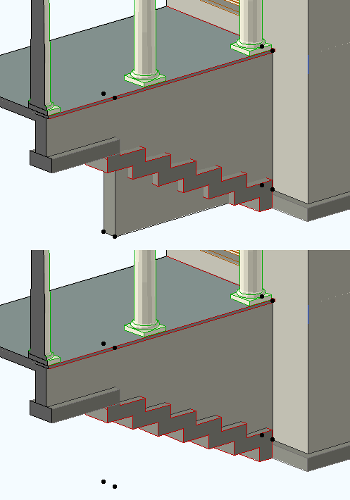
Cutting the foundation wall: The wall which sits atop the object should extend to the edge of the top slab. The wall's base should be at the top of the lower footing. Subtract the object from the wall with downward extrusion. Without SEOs, this object wouldn't be possible.


Cutting the wall.

I was happily (!?!) putting in the rake mouldings for the gambrels on Vassos. On the sixth one, the outer rake failed to subtract from the steep roof of the gambrel. All the others had worked. Imagine my joy when I saw that all five previous subtractions at the same condition had also failed.

The "solution" is to slightly change the edge angle of the upper roof edge. In my case, the angle of the edge when mitered to the upper roof was 74.3651º. I rounded up to the nearest hundredth of a degree, to 74.3700º. To keep the section through the miter looking presentable, I had to change the adjacent edge angle of the upper roof.

Over time I have have seen these subtractions continue to deteriorate, and I have to change the angles again. It's a pain, but there is no other way to model complex rakes.

Update: This issue is greatly improved in 10 and in the later patches of 9.

A single building element, how about a window, will be represented multiple times in the construction documents.

There's the window in a plan, at least one elevation, often two or more sections, maybe/probably an interior elevation, maybe a wall section, and the window schedule. Then there are dimensions and annotations related to the window. Five to fifteen representations of one element is probably typical.

The goal is to generate these representations with as few project elements as possible. The ideal is one. With a one-to-one ratio of project elements to building elements, you can focus on manipulation of an element, knowing the representations will largely take care of themselves.

With multiple project elements per building element, it falls to you to maintain the integrity of each and every representation. You work more, do the same things over and over, have less fun, and make more mistakes, which, considering how hard you've been working, is a downer.

When you choose to draw a building element that could be modeled, you are shifting the responsibility for the representation of that element away from the software and onto yourself. When you unlink a section/elevation, you are signing on to change that one door or window multiple times. As multiple building elements change multiple times, the added work, and the risk of error, grows exponentially.

This ideal of of unity is only partially attainable with current technology. But you should have a good grasp of how attainable it is.

For example, full-height walls are relatively unified. They display well, automatically, in a wide variety of contexts. Low walls, however, are less unified: Since the plan and section fills can't differ, you need two elements, a wall and a slab, for the the plan and the section. (Update: In 10 this is somewhat improved. You can show a top view of a wall, but you can't control the fill.)

The reflected ceiling plan is a great divider. Many elements need to be drawn over. Beams, dashed in plan, need to drawn solid, while floor elements, solid in plan, need to be drawn dashed. Given the current design of the software, we're stuck with this.

A lot a higher-level object design is concerned with getting objects to multi-represent themselves better.

Our job as users is to know these limits, do our best within them, and work around them when we can. If you can cut the number of project elements for a building part from 5 to 3, do it. Reduce repetition where it can't be eliminated.

Part of knowing the limits is noticing when they change. It's important to stay informed about developments in technology which can lessen repetition. This includes improvements in software and in our own libraries and standards. This, in turn, means a willingness to change our habits, abandon obsolete workarounds, and adopt better techniques.

Wall section stuff.

Added layer, F Clg Fin3.

Added LCs, 3. Working Wall Section and A3 Wall Section. Ceiling layer shows in these two, and Working SE (not A2), and Working Model Complete.

Location: 13 Special Construction

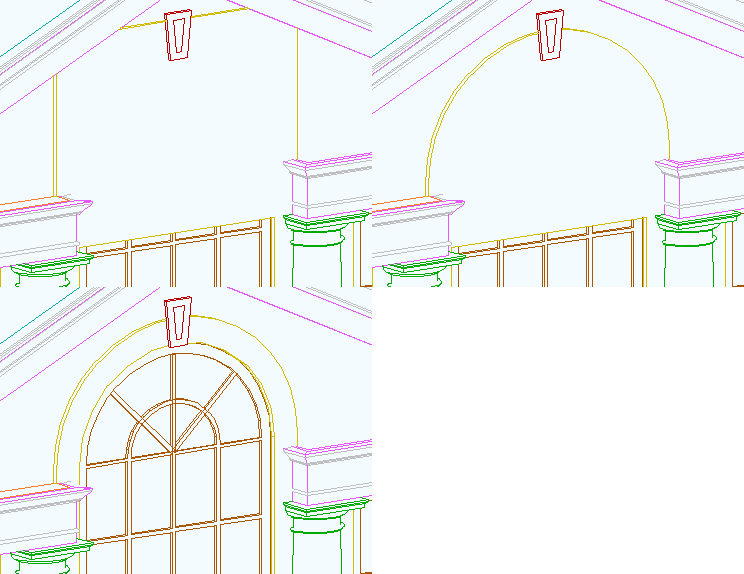
When using a thin wall for casing or paneling, a window for cutting the outside of an arch casing. You can set the height and the width. You can choose to extend the hole on either side of the arch to cut more wall.

Like the Openings in the ArchiCAD library, you can preview the shape of the window in the settings box elevation view.

Here's what it's for. I used an ArchiCAD library arch opening for the inside.


I just realized I never mentioned this. I don't use it very often, but that doesn't mean you shouldn't.

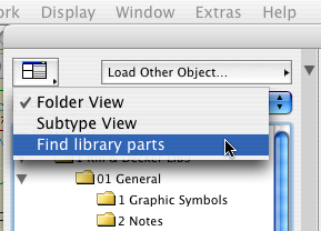
In all of the library part settings dialogs, you can search for library parts by keyword.

At the upper left click 'Folder View' and choose 'Find Library Parts'.


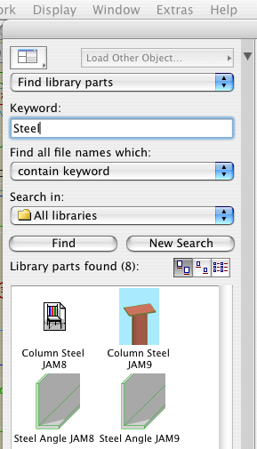
Enter the keyword(s) and click 'Find'. Resist the temptation to strike return; that will close the dialog. You can also refine how the keywords are searched for and limit the search to certain libraries.


The matching objects are shown. If you highlight an object and then switch back to 'Folder View', you will get the folder of that object.

When selecting objects this way, be careful to use the most current version. The find function will show objects in the 'xOld RND' folder the same as any other. Make sure not to choose them by accident.

Remember that it's very easy to drag drawings between layouts while in Tree by Subsets view.

If you have a big pile of new drawings (details, interior elevations) destined for multiple sheets, import them all at once into one layout. Then distribute them by dragging them in the tree.

Q
When I paste elements, is there a way to select those elements?

A
Complete the paste. Undo (Cmd+Z). Redo (Cmd+Shift+Z).

Q
Working in section, is there a way to reveal selected elements in plan?

A
Yes.

Q
How can I tell what elements were affected by a marquee stretch?

A
Undo, redo. The affected elements are selected. Current story only, natch.

When an editing action is undone, the edited element will typically be selected. Comes in handy.

These are the primary functions of layering, in order of importance:

1. Control of display for output. The finished output has to show and hide the right elements.

2. Control of display for working on the project. Showing and hiding elements depending on the work you are doing at the moment.

3. Promotion of logical thinking about the project as a building rather than as a bunch of drawings.

4. Protection of elements used for reference. For example, the walls are locked when working on the structure plans.

Layers exist so elements can be shown, hidden, and locked as needed. Beyond that, layering helps keep the project straight in our minds as we work on it. To this end, layers should be:

Sensible. An architect using an architecture-oriented CAD program should expect to find a layer for "Walls". They would also expect a layer for fireplaces, even though walls and fireplaces display together and don't technically need separate layers. "Put the fireplace on the wall layer" doesn't sound right. In keeping with Virtual Building principles, our layers relate to building parts first, and annotations or drawing types second.

Truthful. I recently added a layer, S Deck, for floor-structure slabs. Previously, we used S Slab. I decided it was poor thinking to call joist decks and concrete slabs by the same name. Layers should encourage clear thinking about the building itself.

Logically Consistent. A stair will be made of elements which display in plan and elements which are 3D-only. So we have two layers, A Stair2 and A Stair3. This arrangement should apply to all assemblies which are split between plan and 3D, such as soffits.

Here's another way of looking at it:

In the design of ArchiCAD, the floor plan is the "main" window. Close it and you close the file. Every element must be on a story, and therefore visible in the plan window at some point. (Even though you can place elements in 3D.)

The first function of layering is to separate the Plan- and 3D-only elements. If we only did architectural drawings, we could get by with just those two layers, Plan and 3D. We would have two layer combinations, Plan, showing only the plan layer, and 3D, showing both layers. This setup meets the minimal display requirement above.

But it would be very difficult to work with. Productivity would suffer as the user went insane. So within the architectural, we have lots of plan layers and lots of 3D layers, which correspond to building parts. In the plan we have walls, cabinets, fixtures, etc. In 3D we have floors, structure, trim, etc. The addition of these layers doesn't advance the display requirement at all, it just helps us stay sane.

It helps our work to have layout and guide elements. Those need layers, since they have to be hidden for output. It's convenient to be able to "permanently" hide elements without deleting them, trashcan-style. It's handy to keep area-measurement fills in the project, but we don't look at them very often. So there are several kinds of administrative layers that don't directly represent the project or the output.

Then there's the invisible modeling tools, cutting roofs and SEO operators.

Once we get into other drawing types, structure plans, etc., those drawings have their own annotations, and require different architectural elements to be shown and hidden. The structure plans require that the landscape walls (hide) be separated from the architectural walls (show). The reflected ceiling plan requires that the crown moulding (show) be separated from the other high trim (hide). If you have two site plans, you need layers for each of their annotations, and for the annotations they share.

The layer setup we have is the product of a years of refinement along these principles. When we add a layer, it should be in order to improve the logic of the system or to facilitate a new/better mode of work. For example, to model wall sections, the crown needs to be positioned taking the ceiling finish into account, and the ceiling finish itself needs to be modeled. But since the ceiling finish is only useful for wall sections, we don't take the time to build it everywhere. Since it stops and starts, it needs to be hidden in building sections so we don't have jaggy ceiling lines. Therefore we need the layer F Clg Fin, as well as layer combinations for wall sections separate from building sections.

I hope this helps answer the question, "Why are there so many layers?"
Location: 06 Wood & Plastic : Railings & Stairs

This is essentially the same as Newel STUM8. It has a cap and a plinth. The only thing I added is the ability to have a different pen when shown one story up, so it can match the behavior of Railing JM9. I figured you wouldn't show it on the story below very often.

All Entries | 1 | 2 | 3 | 4 | Older »