If you UNCHECK 'Use Cut Elements' Section Pens' in a section's settings, all the cut lines are drawn with one pen, and all the fill patterns are drawn with one pen. The background color becomes clear.
I usually want this box checked, so the distinctive section pens of elements can be seen, which aids model organization and usability. For wall sections, I think there are a couple of advantages to letting the marker set the section pens:
• Model elements can be transparent while fills still have opaque backgrounds. So I can mask stone veneer with a CMU fill, without using two fills. Under the current standard, the Fill Background Color Display Option is set to Transparent, which effects model elements and fills.
• Following from above, the A3 Display Option Combination could be eliminated.
• If you use black (15/11) pens for the section and color pens for added 2D work, it's easier to tell which is which. (Note: Elevation pens are unchanged.)
• I recommend a 5-weight pen for cut lines, unless the element is very thin; e.g., a counter. Using a thinner pen for the section looks better at 1/4" scale, but at 3/4" or 1" it looks weak. With uniform pens, you could have it both ways.
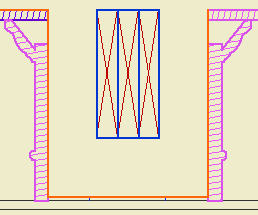
But I don't think we can do it. Certain objects, most prominently Wood Beam JAM9, have clever pen-related section behavior, which the uniform pen feature breaks. This is the wood beam at wall section scale; it knows to draw the X lighter:

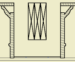
But the uniformity heavies up the X along with everything else:

Which is no good, and it really can't be fixed without patches or conversion to drawing, so what's the point. You can always make a line heavier by drawing over it; lighter, not so much.
The technique might be beneficial for interior elevations, since it turns the gray background off. And interior elevations don't show structure members. We should look into it.
