On Land

Environment Information
At Rill Architects we run ArchiCAD on macOS. If you work at Rill, this is your stuff. If you don't, but you work in ArchiCAD, you may find something interesting. Anybody else, I don't know.
RSS
March 2014 Archive


Library Globals were introduced in Archicad 13. But I only noticed them after jumping to 16, and by that time there were enough examples in the wild to make their value clear. They have enormous potential, especially compared to their relative ease of use, if you are already a GDL/library/standards person.

In GDL there are Global variables, which make information about the project available to library parts. Some globals contain environment information like the current scale, the north direction, or the current viewpoint (window) type. Others are element-specific, so doors and windows can behave intelligently within their walls, for example. Labels can use globals to automatically display information about elements.

Globals are just there, waiting for you to mention them. The global for the current scale is GLOB_SCALE, so:

IF GLOB_SCALE <=48 THEN
     [fancymodel]
ELSE
     [simplemodel]
ENDIF

...means at 1/4" scale or larger, make the fancy version, and at smaller scales make the simple one.

In addition there are Requests, which are different in syntax but have a very similar function. A request I use often is "Height_of_style", which tells you how tall a block of text is. Unlike globals, before you can use the information you have to move it into your own variable.

rr=REQUEST("Height_of_style", textStyle, styleHeight)

The parts of that line are, in order:

rr is a variable to hold the return value of the request, which is not the data we are requesting. Instead it reports if the request was "successful". You can leave it out and the request will still work, but you will get an error. "rr" is my personal preference; it can be "n" or "success" or whatever.

REQUEST("Height_of_style" is the name of the request.

"textStyle" is my previously defined style in the script. You need at least one style defined to do anything with text.

"styleHeight" is my variable to hold the data about the height, which is what we are looking for. Now I can do stuff with that value, like draw a line as long as a text element is tall:

LINE2 0, 0, 0, styleHeight

Other requests can look up the current dimension preferences, the state of model view options, etc., etc. There's a complete list in the GDL manual.

I'm hazy on what makes a bit of information a global or a request. (Why is the layer a global, but the zone category a request?) Anyway, both kinds of things are defined internally by the program, and that was all there was, until Library Globals.

Library Globals allow library developers to create their own model view options.

Let's say I want the steel column objects to display differently in the framing plans and the architectural plans. In vanilla Archicad, that's not a model view option. With doors and windows, I can control whether the openings, symbols, and markers are shown, and then save those settings with the views for different plan types. Not so with the steel columns. I could have a setting in the object to change the appearance, but it's the user's job to switch it back and forth. (Tip: Any workflow with the phrase "user's job to switch it back and forth" is not an optimized workflow.)

With Library Globals, I can create a setting in model view options to change the appearance. I can have the objects respond to the setting automatically. And finally, I can save the setting with the view.

I can create a setting. I can make the objects respond to it. I can save the setting with the view. Are you getting it? I am excited about the potential of this feature.

There are two parts to it:

1. The Library Globals Settings object. This is a hidden object with the "Library Globals Settings" subtype. Parameters in this object become settings the user can modify in model view options. The interface script of this object provides the interface for those settings within the MVO dialog box.

2. The LIBRARYGLOBAL keyword. This works very much like REQUEST, above.

Here is my first application for this feature. I would like to show some structural columns on the story below, dashed, so that in the structure plans you can see that the point loads are being picked up. While I don't mind seeing structural columns in the architectural plans, the dashed-below thing really doesn't work. You get dashed columns in the middle of rooms, which is confusing. So if I want structural columns in the architectural plans I can't show them dashed below in structure plans. And if I want dashed-below columns in structure, I have to turn the columns off in architectural.

What I need is a separate control for display of the dashed-below columns. Library Globals finally provide this.

Again, there are two parts. You need an object with the "Library Globals Settings" subtype. Ours is called "RillLibraryGlobals". You only need one object, even if you are planning settings which affect many different objects. Within the object, I have a parameter with the name "LG_ShowColBelow" (The LG_ prefix reminds me that it's a library global parameter, which clarifies the script on the other end.)

In this simple case, the only script you need in the library globals object is the interface script. This script creates the interface within the Model View Options dialog, where the user will manipulate the setting. Interface script technique is beyond the scope of this post, but the briefest thing that will non-beautifully work looks something like this:

UI_DIALOG 'Options For Rill Libraries', 600, 300
UI_PAGE 1
UI_STYLE 0, 0 ! Small, Normal
     UI_OUTFIELD 'Show posts on story below', 12, 22+5, 148, 22
          UI_INFIELD 'LG_ShowColBelow', 160, 2, 48, 22

Which ends up looking like this in the MVO dialog:

Show columns

That checkbox flips the setting behind the scenes.

The second part is in the object itself, in this case my steel column. The 2D script of the object needs to know about that setting in the library globals object. It's very similar to REQUEST:

!! Library global for column below, show in S, hide in A1
LG_ShowColBelow_val=0 !!initializing
rr=LIBRARYGLOBAL ('RillLibraryGlobals', 'LG_ShowColBelow', LG_ShowColBelow_val)
IF GLOB_CH_STORY_DIST=-1 & LG_ShowColBelow_val=0 THEN END

'RillLibraryGlobals' is the name of the library globals object. 'LG_ShowColBelow' is the name of the library globals parameter being asked about. LG_ShowColBelow_val is a local variable, just initialized, to hold the value found in the library global variable.

The last line says, if we're on the story below the object's home story, and that library global checkbox is off, don't draw anything (END). GLOB_CH_STORY_DIST is the ordinary global variable which says which story we are on relative to the object's home story. One story down is -1.

Then later in the script when it's time to actually draw the column:

IF GLOB_CH_STORY_DIST=-1 & LG_ShowColBelow_val=1 THEN !! story below
     [Draw dashed symbol]
ELSE !! home story
     [Draw solid symbol]
ENDIF

Of course, it's still up to the user to set the object itself to display on the story below. With that set, the MVO checkbox will control the actual display.

Finally, in the Model View Option combinations, that checkbox is on in the structure plans, and off everywhere else.

If we had this model view option, it would greatly help the scale-sensitivity problem for composites and profiles. Background only for small scale output, detailed fills at large scales.

I've wanted scale-sensitive composites as long as I can remember. This seems easier? Note the cover fill option right there. Drafting fills too, sure. Consistency.

Solid Background On Cut Fills Please
Carrot
All the server libraries are in a volume called "2 Libraries", whose icon is a carrot which predates OS X and looks it, and we call the libraries volume the carrot. This is what's there:

BIM Server Libraries. Copies of our standard libraries for use in Teamwork projects.

Library Container Files. An LCF is a compressed archive of a library. It loads very fast and can't be messed up, so it's good for taking projects on the road assuming you don't need to modify standard parts. I try to update the LCF of our current versions' library (13 and 16 at the moment) on a weekly basis. But I might forget, and I certainly modify objects throughout the week, so if you need the LCF you should make sure it's up to date.

Master LIB [n]. Where n is between 7 and 20. The Master folder contains the current "1 Rill LIB[n]" folder, which is standard library that must be loaded for all current projects. It also contains a "Development" folder, which should generally not be loaded; things in there are either broken, unfinished, or otherwise unworthy.

When we start using a new version of Archicad, I copy the entire Master LIB folder and give it the new number. When you switch a project to a new version, you should also change to the newer Master LIB. It will be virtually identical to begin with, but over time the old versions will fall behind. I generally only treat the newest Master LIB as "live" for the purposes of new development and bug-fixing. Back-saving objects, unlike PLN files, is nearly prohibitive in its awkwardness.

Other LIBs. Just what it says. Old project libraries from the pre-embedded days. Old Archicad libraries. (I've lost the 5.1, but we still have the 6.0.) Extracted versions of recent/current Archicad libraries. (Archicad libraries are LCF files. If you want to search them using the Finder, they need to be extracted.)

Alphabetical by name of thing. Please suggest improvements and additions. Many things have changed, many have stayed the same. Layer theory hasn't changed much. Current as of 16, and I'm not anticipating big differences in 17.

Big table below the fold.

More»


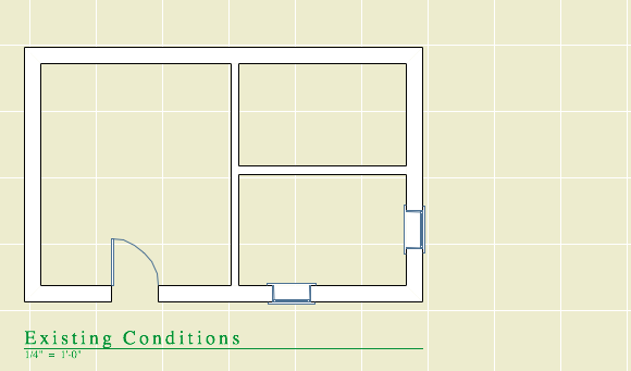
Typically we try to get the existing conditions completed before starting demolition and new construction. It's good practice to save a copy of the PLN at this stage, along with a PDF of the existing plans. But in principle, we should be able to get existing plans out of the project at any stage, and there might be projects where it's not practical to absolutely finish the existing conditions before the design work starts. And this almost works, with some workarounds.

Let's review the basic attribute and renovation filter setup. The natural background color of walls is gray. New walls are gray in output, so the filters are set for new to show; they are never overridden. Existing walls are white in output, so the filters are set for existing to be overridden. Demo elements are white and dashed in output, so they are overridden as well.

In the template, the Existing Conditions filter is set to override the existing elements, turning them white. The demolished elements are set to be shown, but if no elements have been demolished yet that doesn't matter. New elements are hidden, but they don't exist yet. So to publish existing plans at this stage is very simple, because there are no other statuses to account for. Nothing is gray or dashed.

Existing Conditions
Existing conditions before design work

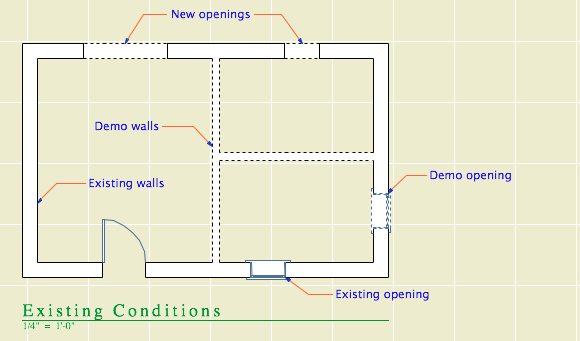
Once the design work has started, if you want existing plans you need to show the demolished elements. And the filters certainly offer this capability.

Remember that the natural fill color of elements is gray. Existing elements are overridden to turn them white. We'd like to keep that. But we can't override the demolished elements, because we don't want dashed lines.

Dashed demo
Existing and demo are overridden, like in demo plans

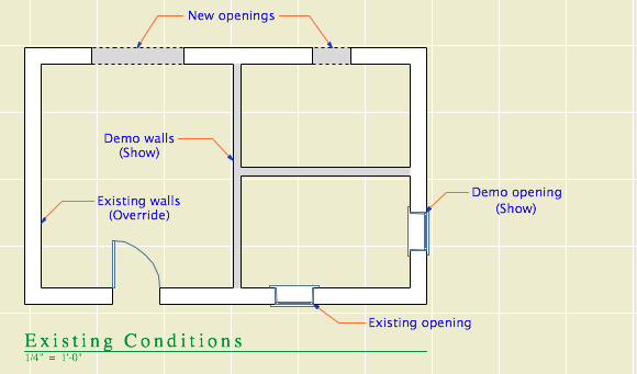
Instead they are shown, which means the demo walls will be gray.

Gray demo
Existing is overridden, demo is shown

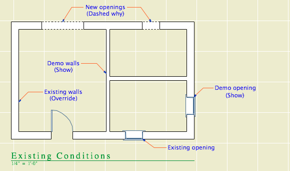
In order to keep the lines solid and turn the fills white, we need to apply a pen set to the drawing element. The poche pen is number 50; all the pen set does is make it white instead of gray. (Yes the screenshot is still of the floor plan. I want them to all look alike. Pen set hacks for output should only be applied to the drawing element, never to to the view.)

Dashed why
Existing is overridden, demo is shown, pen set turns the walls white

But this doesn't quite solve it. With existing elements overridden and demolished elements showing, you will get a dashed line wherever a new opening is placed in an existing wall. I would call this a bug, because if the demolished elements are showing, you should never see the dashed line because it's part of the override style.

If you set both the existing and demolition to show, then the ("new") openings vanish.

All good
Existing and demo are shown, pen set turns the walls white

The existing plans have the pen set ("Layout Existing Plan") applied to them in the template, though if you publish existing plans before demolition, the pen set isn't needed because the existing elements are overridden to white anyway. The pen set is applied this way just in case.

If you need to publish existing plans after demolition has started, you have to change the Existing Conditions filter so the existing elements are shown instead of overridden. Then both the existing and demo elements are the natural gray color, but both are turned white by the pen set in the drawing.

This is a royal pain! It's hard to figure out, hard to explain, and almost impossible to remember. We have to jump through these hoops because of an incomplete feature compounded by a bug. The incompleteness is the inability to vary the override style by filter. We need to override the demolished elements differently for existing and demolition plans. The bug is the display of demolished elements with overridden attributes even though the filter is set to show.

We are on our third version of Archicad with the Renovation feature. This stuff should be solved by now.

These guidelines are current as of Archicad 17-18.

More»

Somebody asked about the animated gifs in the Renovation post and elsewhere. (My favorite one is of the roof with the FPCP.)

An animated gif is special image format which allows multiple frames, with each frame shown for a certain length of time, in a loop. Animated gifs based on video have lots of frames, with very short delays simulating motion picture frames-per-second rates.

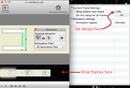
My screenshot gifs have a handful of frames with long delays. They are very simple to make. Without the specifics of any particular application, the steps are:

Take a series of screenshots of the same size, one for each step of your process. The application needs, at the very least, to be able to remember the last selection you used. (The built-in Cmd+Shift+4 function on the Mac does not do this.) Save each image in gif format, or convert them using virtually any image processing application. (But not Preview in OS X, why why why.)

In the gif-creating application, drop the images in, in order. Set the delay for each frame. One to two seconds is a good place to start. Save the whole thing, drag it to the web browser, and enjoy.

For screen capture, I have used Snapz Pro X for years, but it hasn't kept up with progress and started losing its mind under Mavericks. I recently dismissed it in favor of VoilĂ . (The selection-remembering setting is in Preferences.)

For image editing, I've been using Acorn and Pixelmator, but VoilĂ  seems to provide a lot of editing and annotation features on its own so outside editing of the frames might not be necessary.

For the gifs themselves, I'm currently using GIF Animator which I found in the Mac app store and might have cost $1. This is basically the whole interface:

Gif Animator

Photoshop can do it, for more than $1.

PS, Hard G.

Renovation is a feature set to control the display of existing, new, and demolished elements in the workflow of addition and renovation projects. It began in Archicad 15. This feature means we no longer have three of each layer in addition projects.

In the Renovation workflow, there are three kinds of elements: Existing Elements, Elements to be Demolished, and New Elements. This property is the Renovation Status. With a few unimportant exceptions, all elements have a renovation status, and it cannot be blank.

Renovation Filters control whether and how elements of the three statuses are displayed. Filters are saved with Views.

The filters control whether the elements of each status are Shown, Hidden, or Overridden.

I hope showing and hiding are self-explanatory. If elements are overridden, their appearance is controlled by Renovation Override Styles. The attributes covered by the styles are: Line type; Line pen; Fill type, pen, and background pen; and material. There is no consideration for fill category, so cover and cut fills are handled the same. (Fail.) There is only one set of override styles, and they do not vary by filter. (Another fail.) For example, you can't have one filter where overridden demo elements are dashed, and another where they are dense dashed. Whatever the style of overridden demo elements, that's the style for all filters where Demo is overridden.

Because the override styles are responsible for the appearance of overridden elements, elements of different status will have the same "natural" settings. You don't change the line type or fill color of individual elements to show they are demolished.

The styles are set in the template and should be considered set-and-forget.

There are also Additional Filter Options for existing and demolition elements. Right now the only one of these we are using is to turn off markers for doors and windows.

Renovation Palette
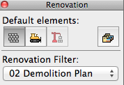
The Renovation palette allows the user to control the current filter, the default status (of elements when they are placed), and the status of selected elements. It also gives access to the Renovation Filter Options and renovation override styles. The palette must always be open when working on addition/renovation projects.

And, keep an eye on it, it will try to mess with you. The current filter can change by viewpoint; it can be new construction in plan and existing conditions in 3D. When this happens, stuff will "disappear". Check the palette. Once the filter is set for a given viewpoint, it seems to stay put. (Both the default filter and the default status seem to sometimes change spontaneously, especially when opening a project on a different machine.)

The status setting is not transferred by eyedropper/syringe. The default setting on the palette always controls. You can change the status of an element in the settings dialog under Tags and Categories, but the palette is obviously easier and a better habit.

Our Override Styles

New elements are never overridden, and have no override style changes. (N.B. This is our decision, not a design limitation of the new status itself.) New elements act as if the filters don't exist. The background pen is gray (#50), same as it ever was.

Existing: The fill is overridden to be Empty Fill. The fill background pen is overridden to be pen 91 (white).

Demolished: The fill and fill background are overridden like existing, and the line type is overridden to be Dense Dashed.

Again, the natural settings of existing and demolished elements are the same as new. The override style turns them white and/or dashed.

See the appendix at the end of this post for examples of the different kinds of output.

Our Renovation Filters

01 Existing Conditions
Existing: Override
Demolished: Show
New: Hide
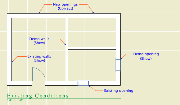
This is used for building the existing model, and publishing the existing plans and elevations.

Existing Conditions

02 Demolition Plans
Existing: Override
Demolished: Override
New: Hide
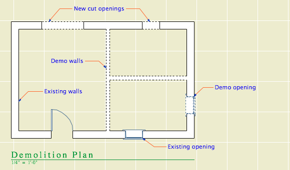
All the walls have white background, and the demo elements are dashed.

Demolition Plan

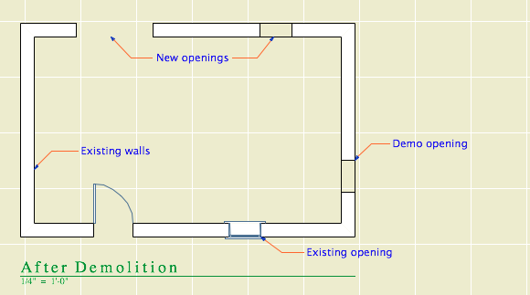
03 After Demolition
Existing: Override
Demolished: Hide
New: Hide
Existing elements only, with the demo elements removed.

After Demolition

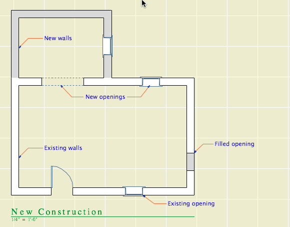
04 New Construction
Existing: Override
Demolished: Hide
New: Show
This is used for most work and output. Existing walls are white, new walls are gray.

New Construction

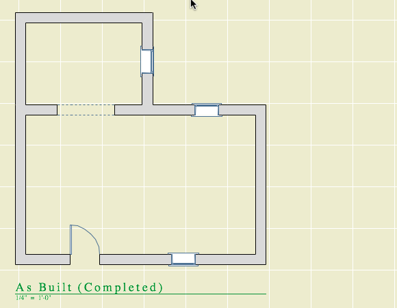
05 As Built
Existing: Show
Demolished: Hide
New: Show
This shows the project when finished, as if it were all new. All the walls are gray.

As Built

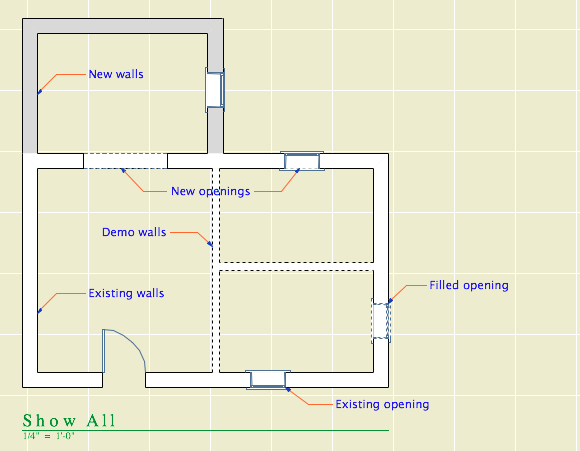
06 Show All
Existing: Override
Demolished: Override
New: Show
All statuses are shown, and you can tell the statuses apart.

Show All

How to Demolish Things

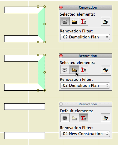
Select an element and, on the renovation palette, click the demolished button. That changes its status from Existing to Demolished. Unless the current filter is Demolition Plans or Show All, the element will vanish. If you switch to Demolition Plans, the element will reappear with dashed lines.

Wall demolition
Demolishing a wall

That's basically it. Of course, you might have to split an element first to demolish only part of it.

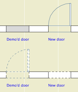
The big difference between the new method of demolition and the old layer-based one is in the handling of doors and windows. Doors and windows are now demolished the same way as other elements. Just select them and change their status. There is no need to split the wall and demolish the piece with the opening in it. When you demolish an opening, it is replaced by a portion of new wall. (Note: That new piece is shown using the natural settings of the existing wall. It's no longer being overridden. That's why all elements have the same natural settings.)

Doors

Further, you don't need to split an existing wall to place a new opening. Just place it normally (check the status!), and you will have a new-status opening in an existing-status wall. And in the demolition plan, the new opening location will be shown dashed.

Renovation Filters in New Projects

Unlike layers, renovation filters have only one purpose. (There's not going to be any hacking the demolition status to do something else.) If there's no renovating or demolishing, you don't need them. So in the New Home template they are not used. The filters are in there, but they are modified to show all statuses all the time, with no overrides. All the views are set to Show All. The palette can be put away.

Special Cases Where Multiple Layers Are Still Needed

Even on a New Home project there are some sneaky existing conditions, those pertaining to the site. We have separate layers for existing and new topography contours. We have layers for existing, "demo" and new trees. We have an optional layer for backing up the existing site's mesh.

I don't think these things are what renovation filters are for, and I can't see "using" them throughout a New Home project just to address these tiny parts of the project work. So we ignore the filters, and we have a few oddball E and D layers left. To remove a tree, change its layer and enjoy the nostalgic moment.

Don't Demolish Notes, Silly Rabbit

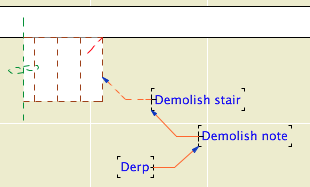
Demo derp

Another layer we didn't delete is +D Demo Note. I have heard of people trying to use one note layer and then make some notes demolition notes by changing their status. This is a category error. Renovation status is for project elements, which represent real things in the world. You're demolishing that note, are you? How? What is the result of demolishing it? Keeping different types of annotation straight is a proper use of layers.

And if we still have the Demo Note layer, we still have the Demo Plan layer combination.

Changes to the Templates

Removed lots of layers.

Implemented renovation filters and override styles.

Applied filters to views.

Updated favorites and default layers.

Created pen set for existing plans.

Secondary Info on Renovation

All element types have a renovation status except hotspots, drawings, figures, and viewpoint-creating tools (Section, etc.).

Elements have a setting in the Tags and Categories division where they can be set to show only on a specific filter, rather than "All Relevant Filters". There's also a button on the renovation palette for this setting. I can't imagine an occasion to use this. That setting is where the warning comes from when you delete a filter: "By deleting a renovation filter, you will lose all elements which are shown only on that specific filter." Since we don't use that setting, we aren't scared of this warning. Further, I don't see the need to delete filters very often.

The filter settings can be imported and exported; they are xml files like Model View Option combinations. (But they import badly, extant filters can't be overwritten.)

There seem to be no GDL globals for renovation status, which seems like a missed opportunity.