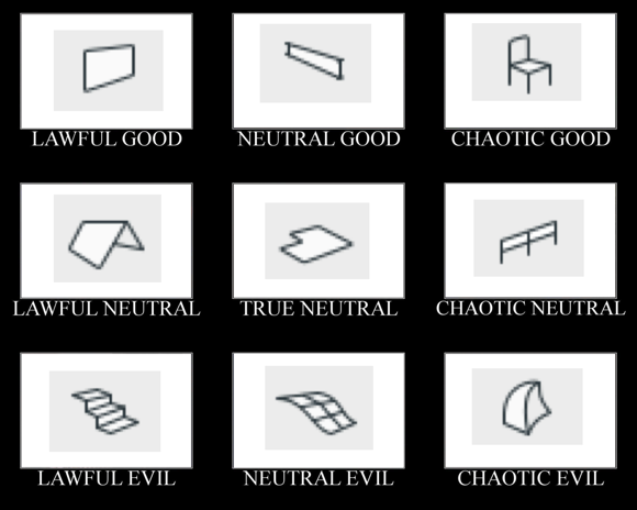
I didn't want to talk this to death. What I like about alignment charts is they are assertive rather than argumentative. You have to just look at them and work out the relationships among the things, and ask yourself if your impressions of the things agree with the author's.
I made this by instinct. The strongest notion I had was that the morph tool is chaotic evil. The second strongest notion was that the mesh tool is a relic and needs to be done over. Then I was on my way.
Having meditated on it a bit, I think this is what the axes mean:
The lawful-chaotic axis runs from standard orderly content to custom content. The good-evil axis runs from user flexibility to user frustration. With that, I will proceed to talk it to death with some comments on each item.
The morph tool is irrational, completely. It is anti-parametric. You can't edit a morph - all you can do is work on it until it's done. If you need to adjust it for a change in conditions, it falls apart. A morph is an end point. Any other Archicad element, you can edit it in Archicad terms. Once it's a morph, it's SketchUp, which is a bad software that you should not use. I think it's a lost opportunity that the freeform tool doesn't seem like it's part of Archicad.
The stair tool is intensely orderly, in that it's all about the rules, but it's crazy complicated. Despite all the rules and options and controls, it's very hard to get it to present correctly for design and construction. Powerful, but awkward. It will work until it breaks, and then it will not work at all. Pro tip: Learn to build stairs.
The mesh tool malingers. Contours are rational, but the rest of it is a do-over. You can't have curved contours. Topo and boundary can't have different pen and line type. You can't set Z levels by value in 3D. You can't make an edge node part of a contour. No vertical surfaces. No 'thick ribbon' construction method. You need SEO to dig a hole. The site mesh should be your site plan - instead our site plans are all 2D. Besides morphs, it's the least BIM entity in Archicad.
The walls run the model, and they run it well. When you model, everything is based on something else. At the base of all the something elses, you will find the walls. Put them where they belong and they will never let you down. And: Composites, profiles, slanting, battered, curving, whatever. The best tool, and not a showoff - we take it for granted.
The objects represent for all the library part tools - door, window, lamp, not to mention zone stamps and labels. GDL library parts are the key to making Archicad behave the way you want, and for overcoming limitations in the other tools. GDL is the single most valuable technology in Archicad. Complain about the tools, then solve your own complaints. Or hire someone!
Beams are made good by custom profiles. Just before your problem becomes hard enough to require GDL, beams are there to do great things. They also rotate and slant and intersect properly against steep odds.
Roofs are the tool where, as a user, you have to let the model tell you what is going on in reality. At this slope, go this far, and where do we end up? With the edge-shooting feature, roofs help you figure out what is really going on with your massing. Along with walls and slabs, roofs _are_ the model.
Railings have a lot of creative potential because they can fit a series of elements to a situation. Like a beam can use a custom profile, a railing can do a custom arrangement. Combined with library parts, they can solve a lot of custom conditions. I am excited about the tool for this reason.
Slabs are in the center because they are steadfast and boring. I have nothing negative to say about slabs. They are as reliable as walls and roofs, but they're followers, and they don't help us much on their own.
Stairs and railings didn't exist. Those are big changes!
I would have put zones in as lawful evil. Another tool due for a full rewrite.
Chaotic neutral, I don't know. I might go annotation and say text. Dimensions, maybe, but aren't they inherently lawful, even with their quirks?
