On Land

Environment Information
At Rill Architects we run ArchiCAD on macOS. If you work at Rill, this is your stuff. If you don't, but you work in ArchiCAD, you may find something interesting. Anybody else, I don't know.
RSS
Meta Archive

All Entries | 1 | 2 | 3

Somebody asked about the animated gifs in the Renovation post and elsewhere. (My favorite one is of the roof with the FPCP.)

An animated gif is special image format which allows multiple frames, with each frame shown for a certain length of time, in a loop. Animated gifs based on video have lots of frames, with very short delays simulating motion picture frames-per-second rates.

My screenshot gifs have a handful of frames with long delays. They are very simple to make. Without the specifics of any particular application, the steps are:

Take a series of screenshots of the same size, one for each step of your process. The application needs, at the very least, to be able to remember the last selection you used. (The built-in Cmd+Shift+4 function on the Mac does not do this.) Save each image in gif format, or convert them using virtually any image processing application. (But not Preview in OS X, why why why.)

In the gif-creating application, drop the images in, in order. Set the delay for each frame. One to two seconds is a good place to start. Save the whole thing, drag it to the web browser, and enjoy.

For screen capture, I have used Snapz Pro X for years, but it hasn't kept up with progress and started losing its mind under Mavericks. I recently dismissed it in favor of Voilà. (The selection-remembering setting is in Preferences.)

For image editing, I've been using Acorn and Pixelmator, but Voilà seems to provide a lot of editing and annotation features on its own so outside editing of the frames might not be necessary.

For the gifs themselves, I'm currently using GIF Animator which I found in the Mac app store and might have cost $1. This is basically the whole interface:
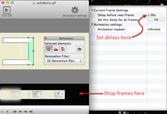
Gif Animator

Photoshop can do it, for more than $1.

PS, Hard G.

Late fourth birthday present to itself. I wanted the tags to be more prominent and I got carried away.

Also more eye-catching is the RSS feed link, that orange thing in the upper right. If you're not using RSS, you should. Briefly, RSS makes it easier to keep up with multiple web sites, because it lets the sites tell you when something has changed, rather than you remembering to go and look. At this point it is difficult to find a site that doesn't publish a feed. Safari can handle RSS feeds directly, or you can use a dedicated reader. There are free and non-free readers for all platforms. I use the non-free and fantastic NetNewsWire. More on RSS here.

Another unsolicited testimonial: In the course of this revision I had an excellent email support interaction with Movable Type. Quick, attentive, and thorough.

What else. I did the whole thing in Coda, which I found quite pleasant. I'm not enough of a pro to appreciate its limitations yet.

Hey Microsoft, your browser is an obnoxious pain. HTH.

Let me know if something acts funny.

I've started adding tags to the posts in here. Tags are 'keywords' which provide another method of organizing related info. They're nice because you can use gobs of them where so many categories would be cumbersome. For example, a category for 'trim' would be silly, but a trim tag is useful. And the detail tag can point to info on drawing details, detail sheets, or the detail tool.

You can see all the tags in use at the bottom of the index page (or click here), and in the sidebar of most of the other pages. In this arrangement, more common tags are shown larger. That model tag is huge.

Tags for each post are shown at the bottom of the post.

When you click on a tag, you get a search results page of all the entries with that tag.

Re: Site title:

1. Grounded. Reality-based. Bobbing around, no, floaty, no, adrift, no.

2. Moderately highly evolved. Up from the muck. Post-fishapod. Still a ways to go until we build the Brooklyn Bridge or anything, though.

3. This too, sure.

Banner image: Canyon de Chelly, AZ

Note: Schedules in AC10 are completely different.

In here, where you can't see them, I have drafts of posts. The list of drafts can be viewed as the to-do list for the site. Stuff I know I have to tell you about, but I haven't gotten around to actually doing it. Many of the drafts relate to features of AC that are very powerful and proportionately complex. I don't want to regurgitate the reference guide, but I don't want to merely point you at the reference guide either. So there they sit. Since we're talking about powerful features, naturally there are other drafts of specific tips which have as prerequisites knowledge of the powerful features.

Anyway it's more important that you have the specific tips than the admirably balanced non-regurguitated, non-merely-pointing-you master post. Between the tips and the reference guide, you'll get the big picture. I hope.

One of these features is the Interactive Schedule (IS). We even had a meeting about it, since it's a lot easier to show and tell than to describe in text. I use the IS for door and window schedules, finish schedules, area calculations, and energy calculations. I also use is as a hack Find & Select for parameters within an object, so you can find all the crown elements that use WM-47 and change them to SM-28. Chances are some of these methods interest you, and I think they should, and I've been stalled in documenting them by the intimidating difficulty of the master post, which you'd think from the title would be this one.

So. The IS is documented in the reference guide beginning on page 374. Consider yourself pointed.

The ref guide does OK at telling you what the IS can do, but I think it's still up to me to point out its limitations. It is still very much a 1.0 feature.

• It only works in plan.

• It is modal, that is, you have to dismiss it in order to work in any other window, unlike, e.g., the Find & Select box.

• It can't do math beyond adding a column of numbers. No way to reduce an area by a percentage, e.g.

• The method for sharing schedule settings between projects is pathetic.

• It has too many poor interface quirks to list here.

It does what it does. In the future it will do more, and it's already way more accessible than the rest of the calculate menu.

More to follow.

PS, another big one is Hotlinked Modules. You need those for the energy calc thing I mentioned above. Sigh.

I got tech tip of the month from Graphisoft for my zone stamp/magic wand thing.

Move everything to the new domain, check.

Convert all the links to the new Movable Type name instead of number format, check.

Convert everything to php, cuz that's what all the coolkids are doing, check.

Strip down the old site and put in the auto-redirect code, check.

Make that welcome post stick to the top, check.

Notice that, while the site is nicely spruced up, some of the actual info is showing its age, so renovate the standards posts about pens and layers, check.

Pat self on back for pen table graphic, check. Fantasize about developing some rollover map of the pen table where you hover over a tile and it shows the weight and color, and hover over a region name and it highlights the region or something, settle for animated gif, check. That would be cool though.

Unchecked: Those !@#$% workflow posts about the new plotter.

Update your bookmarks.

Let me know if something doesn't work.

Ignore this.

Border, dk blue: #000066
Banner background: #0000FF
Surrounding posts: #99CCFF
Body text: #003366
Body text link: #FFF
Body text link hover: #3300FF
Body background: #D1EEFA
Banner Link hover: #99CCFF

I've been fooling around with the site here. Does it look different?

I made two concrete improvements you might appreciate.

In the lower right corner of each post you will find a link that reads, "Printy". Click it and you will get a printer-friendly version of the post, with a white background and all the navigation junk stripped out.

In the sidebar there's a 'Recent Objects' box, with links to recent object-related posts. Library changes are important, so I'm making them harder to miss.

The category Library Development is where I try to document how my objects and libraries are put together. As such, it is of virtually no value to you, and precious little interest. Feel free to ignore it.

Testing testing testing:
IF modelPen>0 THEN
	PEN modelPen
	ELSE
	PEN L_
ENDIF
Testing testing testing.

Over there on the side is a division for 'Current Versions'. These are the versions of OS X and Archicad you should be running. If you're not, then run Software Update and check the onion for Archicad updaters.

All the posts in the Objects category have the location given at the beginning, for your convenience. Unless noted otherwise, the location is the R&D Library, Master LIB 8 : 1 Rill & Decker LIB8.

I have added a link to the links list over there for the Graphisoft Archiguide. It strives to be their technical knowledge base. It's worth checking out.

Over there under LINKS is a link to Archicad-Talk. This is the main user discussion board for all things related to our chosen lifestyle. If you have a question I can't answer, poke around in there. If something isn't known to someone on this board, it isn't known. You must register in order to post, but you can browse and search anonymously.

I have removed the modules from the zTemplate folder and placed them at 3 Resources : Modules. Please get them there, even if you have them in your project folder, as they will be more current.

Rilldeck is now officially 'inoperative.'

Everyone is now running from the new server, 'Nature.' Even if you don't know you are.

A summary of the changes, non-changes, improvements, and your (!) responsibilities.

More»

Please pardon the interruption.

Our new web hosting service was a little 'non-foot-dragging-challenged' with respect to getting everything working for my little noisemaker here.

They tried to stop me. But they can't! They can't stop me! They can, however, slow me way, way down. So I look stopped.

Now I'm going again.

PS: Title Reference [amazon.com]

You have to open it from the file menu in Archicad.

You have to open it from the file menu in Archicad.

You have to open it from the file menu in Archicad.

Once you've saved the project file with the project name, please delete the template PLN. If you saved before saving as, delete the template's BPN. Also, if you're working on a new home, delete the addition template and vice versa. In quantity, these take up a lot of space.

A few Now Contact & Up-To-Date issues & tips.

More»

In my latest attempt to not 1) expect everyone to remember everything, 2) expect myself to remember to tell everyone everything, 3) talk 9 hrs/day, I have begun this website.

More»

All Entries | 1 | 2 | 3