Original here.
Added the ability to extend the side fill along the ceiling on either side, even at an angle.
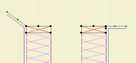
The spot at the end stretches the length, and the spot in the middle adjusts the angle.
Original here.
Added the ability to extend the side fill along the ceiling on either side, even at an angle.

The spot at the end stretches the length, and the spot in the middle adjusts the angle.
# A Development...
Graphisoft will be acquired by Nemetschek AG of Germany. Nemetschek makes the VB-oriented Allplan. They are also the parent company of Vectorworks, the only other semi-serious CAD offering for the Mac, and Maxon, who make the extremely serious Cinema4D and, in turn, the MaxonForm blobby add-on for AC. They also appear to have money.
I have no intelligent observation to make about this, but it's certainly interesting. In one corner we will have a rack of capable European 3D software, in the other, the capable Revit hanging off the side of the Autodesk etch-a-sketch-a-drome. And in the third, the charming and youthful Sketchup, whose models are relatively information-free, but whose parent does nothing but model information.
-James 2006-12-22-1202
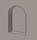
A rectangular or arched shape for subtracting niches into walls.
If the Arch Height is zero, the top is flat. The Wall Pen draws a heavy line around the back of the niche, to match the weight of the wall's contour.
The side with the center node should go along the edge of the wall. That side is drawn with the object's pen.
The idea is to SEO subtract the object from the wall, as discussed here. You can use a window to cut a niche, but the subtraction gives you better display control.
You would typically place the object on the layer X SEO Show2. This is the layer for SEO operators that show in plan only. (In 3D views, you would see the niche, but not the operator itself.)
You might need to bring the object forward to make sure it masks the wall. The parameter Edge Nudge helps make sure the lighter edge line of the object covers the heavier wall contour line underneath. Turn on True Line Weights to check it, and increase the nudge as needed.
(Favorites have improved in the three years since I first addressed them, so the post should improve too.)
Favorites are preset configurations of the tools. They enable you to quickly configure a tool for a given purpose, like option-clicking without the need for a placed element.
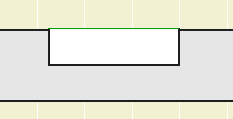
A minor tweak of the venerable rod and shelf. If Wall Line is on, you get a line at the back of the object, drawn with a dedicated Pen. This pen should match the pen of the wall. The new parameter is on by default with pen 15.
Why. Because if the shelf's plan fill is on, it tends to obscure the wall's contour. You could correct this by bringing the wall forward, but now you don't have to.
Historical note: As far as I can tell, this was my first object in GDL, with a date of 9 August 1999.
Everything in Stair Body JM9a still applies.
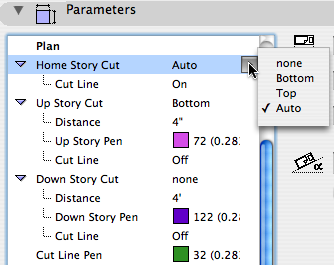
Major feature added: You can choose to have the stair cut by the Floor Plan Cut Plane. Recommended.
With the 'Auto' cut setting, you can choose to show a Cut Fill instead of the cut line. This will show the true cut thickness of the stair, similar to the roof element behavior.
Minor feature added: Separate cut line switches for the above and below stories.
After I posted about the jellyfish a couple third-party observers commented, paraphrasing, 'Duh, of course you need to turn the hidden stuff off'. (Quick review: The issue there was clustered arrangements of elements, where AC was taking a long time to sort out the hidden lines.) Maybe so, but the last time we visited this issue, which was probably way, way back when, it didn't make much difference. But our projects today are more complex, with many more polygons, so we should look into it.
I tested the front elevation, with fills, of the hairiest project I could find. On the Quad G5, generating the SE from scratch took 2:45. This is with all the interior elements on.
I made a new layer combination and hid the interior elements. This includes:
• Structural columns, beams, footings. (Remember, we don't do joists or rafters.) (Also remember, architectural columns are layered as walls.)
• Interior walls (which shuts off the doors, natch)
• Interior trimwork
• Appliances, mechanical equipment, plumbing fixtures
• Stair parts
• Fireplace flues
Generation time: 2:15 (18% better) Noticeable, if not life-changing, improvement.
The question: Should the templates be equipped with such an LC?
• The improvement would only be noticeable on very complex models.
• A separate LC would mean a separate clone, making the view map more complex.
• SE generation will improve as we move to Intel hardware.
The dramatic slowdown in the jellyfish was caused by 'clumping' of elements in an unusual case. Such cases could be handled piecemeal, not burdening the template. Templates should be geared toward standards and typical usage.
I'm going to say the improvement isn't worth making the templates more complex. On a complex model, it might be worth forking the A2 LCs.
On a truly large, multistory building, I think it would be advisable. As you add lots of stories, it would seem you're adding interior polygons faster than exterior.
And I reserve the right to change my mind after another 8 years.
Smarter cleanup please.
