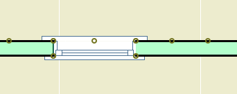
First, to review: The New Construction renovation filter has these settings:
Existing: Override
Demolished: Hide
New: Show
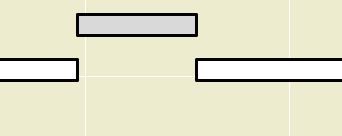
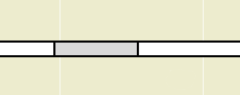
In plan, new walls are gray and existing walls are white. Demolished elements are hidden.
When you demolish an opening in an existing wall, the opening disappears and is replaced by a piece of wall whose status is new.
I think this behavior is correct and intuitive. My only quibble is with the lines on either side of the new segment. I'm not convinced the lines should be there at all, and using the cut pen definitely makes them too heavy. But I can overlook it. (Archicad does not consider the difference between element-is-cut and cut-element-meets-air, and I think I have given up waiting for that to change.)
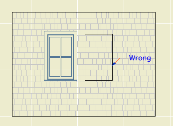
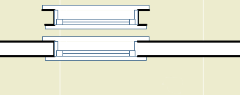
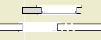
I can't overlook what happens in the elevation. The filled-in portion of wall is explicitly drawn with the shape of the demolished window. There's no way this is OK.

Note: Cut new siding at old window location
• The new wall fragment is based on the existing wall, so it has the same surfaces. Where elements of the same surface meet, the line should disappear. (This is true in AC17. In 16, the material of both sides of the filler piece matches the edge material of the wall. No words.)
• With the surface cleanup rule in place, they would have to create an exception to it, in the belief that it is conventional to show filled-in windows on elevations. We have never done this.
• If I did want to show this condition, it would be dashed and in a lighter pen. These options are not offered. It has nothing to do with the override styles, even though the override setting is what is causing the rectangle to show. The GDL of the demolished window is not involved. The rectangle is drawn with the outline pen of the wall, making it a heavier line weight than the proper windows on the same elevation. Bad graphic, no user control. It couldn't be wronger.
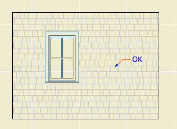
So we need to get rid of it. I stumbled on a way. (N.B.: In the reference guide, there is precisely zero discussion of elevation and hidden line viewpoints in the Renovation section. Once you leave the floor plan you are on your own. Unless you're issuing OpenGL demolition docs, which, um.) In the As Built renovation filter, both existing and new elements are set to show. In the plan, we can't have this because the existing and new look alike. But in the elevation, it means the filled-in wall blends in and there's no rectangle.
Alright! We just need to use that filter for elevations. Maybe change the name so its purpose is clearer. I don't mind workarounds as long as they work, ya know!
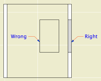
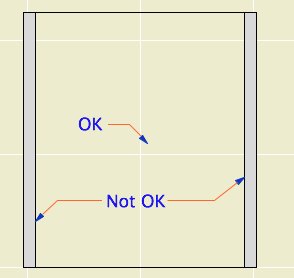
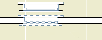
What? Sections? Right, they have cut elements (existing needs to be overridden) and uncut elements (existing needs to match new).

Right like the plan, wrong like the elevation

Good elevation, but we can't tell new from existing
It looks like that filter trick doesn't solve it, and I think we've reached the end of the line. Direct demolition of openings just doesn't work. I don't know how they released this feature in this state, and I don't know how they haven't fixed it three versions later. It's really poor.
We will continue to use renovation. But we have to go back to the old method of splitting the wall on both sides of the opening, demolishing the piece, and filling in manually with a piece of new wall. This works reliably as ever and cleans up in all views.
The logic of renovation is that removing an opening involves creating some wall. When I create a wall to meet another wall and their surfaces match, there is no line. That stupid filled-in chunk should do the same thing.
In situations like this, where a plainly wrong graphic is presented as normal, I get the feeling that Graphisoft's strategy is to hope that conventional documents are swept away very soon by BIMx Docs, live cutting planes, and iPad Pros. My concern for "pens" will seem as quaint as a wax seal! I think they underestimate the status quo bias on the average job site. Today, I need drawings that function in the field. The present is sadly non-futuristic sometimes.
That new world, when it comes, is going to have graphical conventions too, and users will always be charged with turning an ever more complex model into visual information that people can use. At the moment there is a disconnect between the information I can attach to the model ("This window is to be removed"), and the tools to convey that information. ("If this is removed why is it showing?") It should be a core competency of Archicad to bridge that gap.
How to Demolish Openings
First the simple case.
Split the wall at both sides of the opening. The split can be right at the opening's ends, or you can allow some slack.
Drag a copy of the wall with the opening. It's less confusing if you drag it away.
Demolish the opening's wall by switching its renovation status to Demolished. When you demolish a wall, openings in the wall are automatically demolished.
Change the copy's status to New, and delete the opening.
Drag the new wall back in place.
The more complicated case is where a new opening will be placed overlapping the demolished opening. In this situation the pair of walls (demolished and new) must be extended to span both openings, so that the new opening is placed entirely within the new wall.
Placing New Openings in Existing Walls
You do not need to split the wall to place new openings in existing walls. Just place them. The new opening will appear as a demolished portion of wall in the demolition plan. As far as I can tell, there are no graphical problems with using this, the intended technique.


