On Land

Environment Information
At Rill Architects we run ArchiCAD on macOS. If you work at Rill, this is your stuff. If you don't, but you work in ArchiCAD, you may find something interesting. Anybody else, I don't know.
RSS
September 2007 Archive

Location: 06 Wood & Plastic / Shutters

Note: Though the name says 9, it needs 10.

Very basic window shutter(s), perfect for existing conditions.

Single or Pair: If it's a pair, the shutters will be spaced using the object's length setting. This way you can stretch the opening to fit a window.

If it's a pair, you can Fit Pair To Opening, which sets the shutters' width to half of the opening dimension. If Fit is off, or if it's a single shutter, Shutter Width controls the width.

The basic dimensions of the shutter are Frame Thickness, Frame Width, and Panel Thickness.

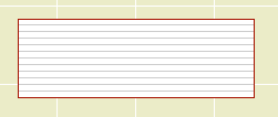
Panel Type can be Flat, Raised, or Louvers. If it's Raised, you can set the Width of the border and Thickness of the raised part. For louvers, use a fine weight for the Louver Pen.

We don't have infinite panel arrangement options; it's a basic shutter. You can have one or two panels. You can have Equal Panel Heights, or a Square Panel at the top or bottom, or you can set the Bottom Panel Height manually.

Location: 13 Special Construction

A big dull block for subtracting a rectangular hole into a ceiling slab. Why not use a slab for an operator? Why not just draw a conventional hole in the slab? Because while the 3D block is dull, the plan symbol is rather clever, responding intelligently to the new ceiling switch in Model View Options.

Dashed in Plan

To review what the ceiling switch is all about, check the Ceiling Line JM11 post. Like that line object, the soffit cutter has separate attribute settings for plan and RCP. Either set of attributes can match the objects settings, while the other can differ. I like to treat the plan as primary and the RCP as the variation, so I have the object's linetype set to 'Dense Dashed'. In the parameter list, the Plan Linetype is 0 (matches the object settings), and the RCP Linetype is Solid Line. You can also change the pen, but I don't see the need.

RCP fill editing
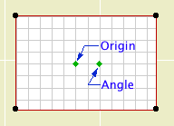
There are also settings for an optional RCP Fill, with the typical Fill and Pen settings. If you turn on the Fill Origin, you get two editing nodes for moving the fill origin and rotating the pattern, like a regular fill. No handle, just pay attention.

The cutting takes place with solid element operations, with the main ceiling as target and this object as operator.

Such an object has peculiar display requirements so the layer is very important. It shows in plan, RCP, and working model/section/elevation (so you can work with it), but is hidden in output sections (where you want to see the effect of the operation but not the operator itself). So in the templates we have a new layer, X Ceiling Cut. Like most cutting layers, it's wireframe. You would need to create this layer in running projects and show/hide/wireframe it as described.

Of course, sadly, for a non-rectangular hole you still need to use a slab, and you still need to trace.

Original here.

You can have a Second Crown above the first one. The Nudge parameter controls the overlap of the two crowns in section. And, a Cap, which is just a block like the base. (Turn all the mouldings off and you have a simple post.) And, a Bead moulding between the panels and the top crown.

Sheet T1
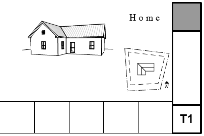
Things on the cover sheet and where they come from.

First of all, the cover sheets have their own master layouts, C Cover, D Cover, and E Cover. The 'data zone' at the bottom of the sheet is proportioned differently for each sheet. This way, if you need to change the sheet size, you just change the master and you don't have to worry about resizing the legends and whatnot.

Because the cover sheets are all customized, a lot of the information rests on the cover master rather than in the cover sheet layout itself. Throughout, I'll refer to the 'master' and the 'layout'.

More»

Location: 03 Concrete

A 3D concrete beam with rebars, and/or a 2D symbol of a concrete beam section.

Placed in...

Model means a 3D beam that will show up in plan and section. Note that the actual placement will very likely take place in the plan window.

2D Detail means a 2D symbol of the section through the beam, suitable for placement in a detail or wall section window. This mode has no 3D part.

Depth is the Z dimension.

Top Width allows you to make the top wider for slab-thickening applications. Zero means keep it rectangular.

Rebar Size: Choose a number.
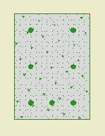
Model Beam Section
Section through Model beam
Put in the number of Top Bars and Bottom Bars. Zero is OK for either one. Bar Coverage refers to the minimum dimension between the bars and the outside. Within the coverage, bars are evenly spaced. Mid-Height Bars puts a bar at the midpoint on the right and left.

Note that the bars are not modeled at scales smaller than 3/4". They will be visible in wall sections, but not building sections.
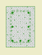
2D Detail
2D Detail mode with stirrups
Stirrup Size: Choose a number. Zero means no stirrups. Be advised that the stirrups are not modeled in any case. They will be shown dashed in the 2D Detail mode, and called out in the label of the plan symbol.

Concrete controls the display of the 3D beam itself in Model mode, and the fill pattern in 2D Detail mode. This effectively gives the option of 'bars only' for cases where the concrete is already represented by another element, such as a 'real' beam.

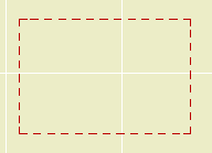
Beam Outline: 2D Detail mode only. Controls the display of the rectangle, independent of the fill.
Model Beam Section
In Plan
Plan Symbol: Model mode only. 'Rectangle' draws the top view of the beam. 'Single Line' draws one broken line. 'Multi-Line' draws one broken line for each bottom bar.

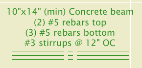
The Label is for calling out the beam in framing plans. By default the label describes the width, depth, rebars, and stirrups. Label Bars Only turns off the dimension part. (min) adds that text after the beam's height dimension. Stirrup Spacing only applies to the label; remember the stirrups are not modeled.

I think the label is pretty intelligent about describing the beam's composition in most cases, but if you push past its limits you can turn on the Custom Label and write whatever you want on the three lines.

ID Tag is the typical circle for referring to the beam's structural calculations.

Tips:

• For a simple opening in a concrete wall, use Model mode, turn the Concrete off, and set the label to Bars Only.

• Modeling the beam is usually preferable. The only thing the modeled beam can't do in section is show the stirrups. You can add a section symbol for the stirrups by using 2D Detail mode, Concrete off, Stirrups on, zero rebars.

Location: 08a Doors

The interior door.

More»

Location: 13 Special Construction

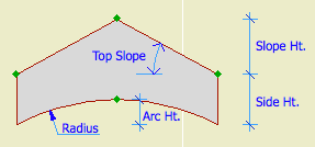
For modeling a vaulted ceiling under a flat ceiling or a gable roof.

Barrel ceiling section
Heights are editable in 3D and section.

Turn on the Ellipse parameter for an elliptical curve. Other wise it's a simple arc.

With the Model View Options in 'ceiling mode', the object can use the optional ceiling pen, linetype, and cover fill. (Use the layer F Trim Crown, which shows in RCP and section/elevation combinations.)

Barrel ceiling in RCP

The Arc Lines option will draw lines with variable spacing to illustrate the curve:

Barrel ceiling arc lines

You can use the arc lines as a 2D-only symbol by turning the Model parameter off.

Download (Requires Slope macro)

Somebody asked why the flue object can't show a thickness for the flue liner itself.

Flue on Nothing
One reason: The flue sits atop, and lines up with, the top of the smoke chamber object. In section this gives a continuous void. If a thickness is built in to the flue, there would be a discontinuity at the top of the smoke chamber, and the flue would appear to be supported by nothing. Building the flue thickness should help make a better detail, yet this is worse. I could partly solve this by narrowing the top of the smoke chamber, but that doesn't help with the other, bigger, reason.

The other reason: The flue is designed with SEOs in mind. You have to use it as a subtraction operator, or there's no point. It is a simple solid tube (EXTRUDE, actually) which we use to make a simple void. If the flue wall has a thickness, it becomes a solid ring with nothing in the middle.

Flue Filled
When you subtract with a ring, you get a ring-shaped void, with solid, un-subtracted material in the middle. If you cut a section through such a thing, you'll get masonry fill with two stripes of flue-wall fill going through it, and no void.

Flue Air Fake Air
To fix that, I could simulate emptiness within the flue by filling it with solid stuff with a clear section fill. In order to see this stuff and the wall thickness, we would need to make the flue's layer solid instead of wireframe. The problem there is that in a marqueed 3D view, there would be no void.

Well, I could wireframe the layer in building section combinations and make it solid in wall section, and I could make the thickness option scale sensitive in the flue and the smoke chamber, but we're into serious inelegance now. It's a void, except when it's not and it's simulating a void, and it's scale- and layer combination-dependent, and do I 'really' subtract it to 'simulate' a void, I can't remember.

Once again we have met a limit in GDL object technology where the simplest solution is for Graphisoft to give us more power. There is a directive, MODEL, which allows you to build shapes in wireframe or surfaces-only mode in addition to the default, normal, solid mode. MODEL WIRE makes a wireframe shape that looks exactly like switching a layer to wireframe. MODEL SURFACE makes a shape that looks normal from the outside but is hollow. This sounds promising for our problem until we realize that only MODEL SOLID shapes can act as SEO operators.

Therefore, I want a new MODEL option which will make shapes wireframe, but which will allow the shapes to act as operators. So the flue wall would subtract, and the void within the flue would subtract, but the void would still be a void. My first stab at a name is MODEL OPERATOR, but I'm open to suggestions.

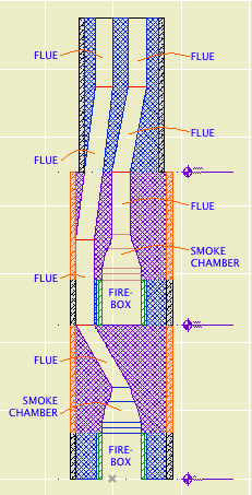
Flues Section
Not for Construction

The path of the smoke inside the chimney is created by a series of SEO subtractions using the Smoke Chamber and Flue objects as operators. The targets are whatever elements the objects pass though.

Each firebox has a smoke chamber directly on top of it.

Directly on top of that is a flue object. In a simple chimney where the flue goes straight up, that might be the only one you need. Usually, however, you will need a chain of flue objects to accommodate bends in the flue. The bending is done by offsetting the top of the flue object.

All the smoke chambers and flues should be on the layer A Flue. This layer shows in plan. The flue object has display controls so you can decide how much of a particular segment will show in plan. For a slanted segment, you can choose to show the 'X' at the top or bottom position of the segment. Don't forget about showing objects on stories above and below.

The smoke chamber should be drawn with a white pen such as 60 or 80. Make sure it isn't a thick white pen. (In the 11 templates this is #40.) The smoke chamber can show the 'X' in plan as well.

Like with any vertical modeling, you will find it very helpful to cut a couple of sections through the chimney to line up the flues top to bottom. But: The A Flue layer is set to wireframe by default. You won't see the flues in section unless you switch the layer to solid. The objects should use Air Space as their cut fill to differentiate them from the surrounding masonry material.

Flues Marquee 3D
Another visualization tip: Place a marquee with half the chimney inside. You would want the flue layer back in wireframe mode for this.

Flues Solid
Another tip, or maybe this is just a cool trick. Use the layer combination x View Flues, which wireframes the A Fireplace and A Chimney3 layers, and makes the flues solid.

If you show this to a mason he will have a good laugh, but it does allow you to schematically design the chimney and determine if you have enough space for the flues to fit while maintaining allowable slopes. (Which, right, that one piece looks a little stressed.)

Related:
Chimney/Fireplace 1: Fireplace in Plan
Chimney/Fireplace 2: Chimney in Plan and 3D
Chimney/Fireplace 4: Hearth Structure
Chimney/Fireplace 5: Chimney Top JM11