The interior elevation tool is like a compound elevation tool geared towards presenting rooms rather than whole buildings. It creates a group of sub-viewpoints within a header viewpoint. The header viewpoint is a polygon, which is, in turn, generally associated with a room. Each edge of the polygon shows one wall of the room, in its own window. IEs can be made aware of zones such that they fit themselves to the zone height and automatically name the viewpoints after the zone. The polygon can be complex, though that makes the markers tricky, and they can be a single line/wall.
IEs have some frustrating and obvious limitations, extra-frustrating for being so obvious, but I think you can be productive with them. Sometimes. So a lot of this is workarounds, some more successful than others.
The first important division in the IE tool is that between Single and Group types. Groups are polygons and are used for all, or some, of the walls in a room, while singles are lines and elevate one wall at a time. Whether an IE is single or group is determined by geometry method. All but the first make a group:

The two types each have their own marker types. When you switch the geometry method from single to group, you will notice the marker options change.
I think it is helpful to treat the group as the general-purpose IE type, and the single as the weird exception. This is certainly true if most of your rooms are rectangular. So, groups first.
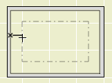
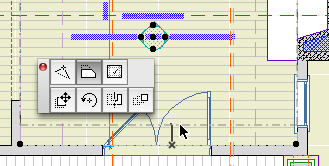

An IE group can be any shape with any number of sides, but the group marker is very strongly biased in favor of rectangular rooms. Here's a normal one:
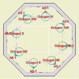
If you create a 3- or 5-or-more-sided IE polygon, the marker will choke and fail to show any arrows:
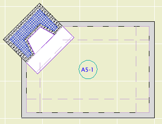
If you create an irregular 4-sided group, such as a trapezoid, the marker will draw the arrows but they might be confusing:
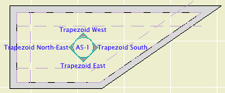
If you have a rotated rectangular room, you will see the same result. This is really not good enough at all. Hey I just noticed: The right and left direction texts are wrong too. Great.


This is reasonably intuitive and actually pretty cool.
But, what do you do with the weird room? There's a workaround built into the IE tool, which is that you can use single markers to represent each side of a group.
If there are six walls, you will get six markers. This gives a decidedly cluttered and, to us, non-standard appearance. Before resorting to this, try a combination of group and single markers.
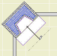
It is simply a line. Draw the line along the wall to be elevated, then back up to where you want to 'stand'.
Editing a single IE after placement can be frustrating because the behavior is different from the group IE. With a group, you can select the marker (easy to grab) and edit the polygon (harder to grab since it's against the wall). To edit a group offset line, you need to select it directly. In contrast, when you select a single IE marker you can move the offset line, but not the line against the wall. You would need to select the wall line directly, which is tricky since it's against the wall. Tip: Shift-click on the wall with the IE tool active.
That's right, two totally opposite interactions within a single tool. Another one for the permanent bug file.
Use a single when you only have one interesting wall in a room, or if you need a fifth interior elevation in an irregularly shaped room. The corner fireplace is a classic case.
Height can be relative to story, relative to project, or it can detect zone height. (IEs can fit the zone height automatically, but not the zone perimeter. Good luck remembering that.) I usually use relative to story. The bottom should be top of finish floor, the top should be bottom of finish ceiling.
For IEs, I like to use the ID to identify the story. I have nothing to add to this viewpoint discussion.
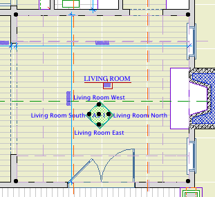
IE names can use autotexts to name themselves after their room's zone, and to indicate their orientation based on project north. Our standard name format is the name followed by the orientation as shown here:
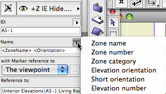
The orientation should be omitted if there is only one elevation in the room. If the IE is not associated with a zone or the autotext is not working for some reason, you can put the name in manually. You can also have a manual name with an autotext orientation, etc.
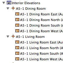
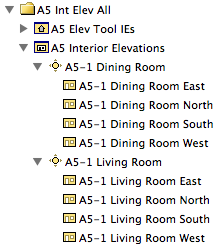
If you drag a whole room of views from the view map to a layout, you will get one drawing element for each wall. Be aware that the default drawing order generated this way makes no sense. Of course, you can also drag the sub-viewpoints individually. More on this when we discuss the interior elevation sheets.
Like sections and elevations, there are two layers for IEs: +Z IE Hide and +Z IE Print. The difference should be clear. You might create the IEs on the Hide layer and only move them to Print when you get the layouts set up. Unlike sections and elevations, there are no IEs placed in the templates, simply because there aren't any rooms yet. (There are favorites, though.)
The standard group IE marker is IE Group Marker RND. The standard single marker is IE Single Marker JM11. Don't get me started on markers. You won't have much need to mess with the marker parameters themselves; they mostly just work.
There are a couple of items under the Model tab in the settings dialog you should be aware of.
Exclude View blocking walls: I think they offer this option so you can elevate a wall where an acute corner angle would cause the adjacent wall to partially obscure the elevated wall. (Example: The trapezoid room above.) This condition rarely obtains in our work, and the switch causes undesirable side effects, such as hiding 'bookshelf' walls in front of the main wall. Kinda defeats the purpose of interiors. Leave it off.
Transparency: Off as usual. Remember that in AC 11 this is a viewpoint setting and is not connected to the 3D window.
The IE tool has no Marked Distant Area capability. When you are elevating a flat wall, this usually doesn't matter. You will notice it when looking at a wall with a large opening and columns.
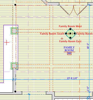
In this case you will see the wall beyond, even if it's very far beyond. In fact, there is no way to limit the depth of the view beyond the wall at all. This is a serious failure in the tool. If it had MDA it might be tolerable, but no.
The solution is to use an elevation (not a section) instead. Our elevation marker can be set to look exactly like an IE marker, so you can superimpose the elevation and IE markers and it will look OK. You can also overlap single and group markers in the more-than-four-walls case.
Another case is where you want to do a multi-story IE. It's easy to create such a thing, just make it taller. But the Show On Story setting is completely broken; the marker can't be shown anywhere other than 'Home'.
This is why we have that elevation clone under the Interiors subset in the project map. Make sure your 'elevation' IEs have an A-5 ID so you can pick them out. The standard elevation marker, Elevation Marker JM11, has a checkbox for Int Elev Mode, which makes the marker look like the IE marker.
Pros:
Automatic naming from zone
Polygon editing to remove and restore side viewpoints
Proper viewpoint hierarchy in navigator
Height setting can relate to story
Cons:
No MDA or horizontal view limit
No automatic update with zone
Bad markers on irregular or rotated group IEs
Inconsistent editing interactions between single and group IEs
Broken multi-story marker display
Careless default drawing order on layout
The interior elevation is one of the more frustrating tools at the moment, but I expect it to improve. In the meantime, I use it, though I curse it quite a bit.
