• Wall Cleanup.
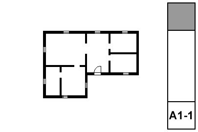
Plan layer combinations should have different intersection codes for plan and 3D walls. (E.g., A Wall Ext has '1', A Wall3 has '2'.) This eliminates gaps where visible and invisible walls meet.
Wall cleanup has improved greatly over the years, but can still be tricky for complex intersections. Use a patch if you must.
• Display Order.
(Front, back, etc.) Use display order to to make overlapping elements stack correctly. In order for elements to mask elements behind them, they need a fill with a background pen. If you don't want a fill pattern, use 'Empty Fill'.
Generally, annotations should be all the way in front so they aren't obscured by anything. Walls should in front of everything except annotations. Beyond that, you have to pay attention. Counters in front of floor fills, soffit lines in front of counters, stair railings in front of treads, etc.
• Pens.
More on pens here. Walls are 5-weight (usually 15). Edges (Counters, stairs) are 2-weight. Dashed overhead elements are 2-weight. Appliances, plumbing fixtures, and other such objects are 2-weight. Floor finishes are 150. The background pen of construction elements is 50, and existing construction elements are overridden by pen 91.
A note on composites: Contour, separator, and background pens should set correctly in the composites. Walls in plan should be set to use the composites' pens. Stud wall composites should have the separator lines hidden; that is a composite setting, not a wall setting.
• Floor Finishes. Either: 1) Fills on F Floor Fin2. 2) Slabs with a cover fill on F Floor Fin2. 3) Cover fills on the zones. In practice #1 is most common.
• Dimensions. Here. For small rooms, consider enlarged plans and put the dimensions there.
