On Land

Environment Information
At Rill Architects we run ArchiCAD on macOS. If you work at Rill, this is your stuff. If you don't, but you work in ArchiCAD, you may find something interesting. Anybody else, I don't know.
RSS
January 2008 Archive

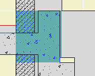
Pen 50 is the poché pen. It is gray (80% +/- I think) in model and layout pen sets. It should be the background color of any cut fill in new construction. (Existing condition elements are white.)

That said, one of the advantages of pen sets is having black+grayscale output while the much more colorful model pens help you stay organized. So we have an alternate poché pen, #70, which is sort of tealy in model but looks exactly like pen 50 in layouts.

Elevator walls
The original intent for this pen was to distinguish multi-story walls (then new in Archicad 10) from their single-story brethren. I don't use multi-story walls as a rule, but I like them for elevators. In any case, the color difference reminds the use that when you edit this element there will be consequences on remote stories.

Lately I've been using them for other distinctive conditions.

Elevator walls
Modeling walls. For example, walls on the layer A Wall3 are usually needed to get a dormer to close in model. The color reminds you they don't inject their misleading selves into the output plans.

Profile Patch

Complicated 'patching' profiles. The color makes clear where the profiles meet the conventional elements.

In Archicad terminology, a marker is a special object that has a subordinate relationship to another element, representing the element and/or saying something about it. Viewpoint markers represent viewpoints in project windows. Each viewpoint type has its own marker objects. There are default markers for each one in the Archicad library, but we (as usual) use customized stuff. Each marker is dedicated to a viewpoint, but all the markers have a lot of parameters in common. Here I will lay out those similarities, as well as the special features of each marker, while making sure we're clear on the correct marker for each viewpoint type.

More»

Location: 04 Masonry / Chimney & Fireplace

The chimney proper is built from walls and slabs. At the top things tend to get weird, with a lot of zigging back and forth. This object should help with that, as well taking care of ending the flues.

Executive summary: Build up a stack of up to eight stages of masonry. The stages can be offset to each other, and can slant as needed. The flues are cut through the stack. Flues can be arranged automatically or moved around.

Chimney stages
Stages

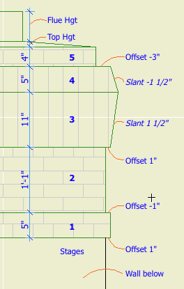
You can have up to eight, and you can have none. (Let me know if you need more.) Each stage is turned on by setting its thickness to greater than zero. Stages must be built in order. If a stage has zero thickness, those following it are not available.

Each stage has parameters for Thickness, Offset to Last, Slant, Material, and Section Fill. Offset is the difference in size from the top of the previous stage. (The first stage is offset to the objects length and width, which will match that of the chimney elements below.) Slant allows the stage to get narrower or wider toward the top; positive values increase size, negatives decrease. A slant of zero is vertical.
The first stage should always be offset; if it's flush with the chimney, you should eliminate it and make the chimney (walls or slabs) taller.

Flues

Quantity between zero and four. I think the zero case would be quite rare, but there it is.

All the flues will use the same Material and Section Fill parameters.

Flue dimensions can Match, or they can be set independently.

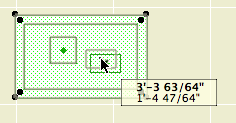
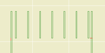
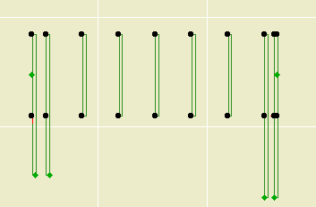
Flue Arrangements: Both Auto arrangements line up the flues down the middle of the chimney. Auto Max spreads the flues as far as possible between the ends of the object, staying within the Minimum Chimney Thickness. Auto Min puts the flues as close together as possible in the middle, with the Minimum Flue Spacing between them. Customize allows you to move the flues around in plan using the editing hotspots.

Flue editing

Note that the object doesn't check if the flues fit; it's up to you to make sure the whole thing is big enough.

Flue Height Above Chimney is the distance the flues stick out the top.

The Flue Thickness in Section option shows the flue thickness all the way through the chimney. Otherwise, the flues are simply sitting on top of voids cut directly through the chimney parts. You will usually have this parameter off in order to line up better with the flues in the chimney below. As discussed here, it is nigh-impossible for the flue object to show its thickness. If it ever becomes possible, the chimney top will be ready.

Chimney core
Core

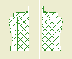
Section only. Obviously. There's a big blob of something, probably CMU, in the center of the chimney, cutting through all the stages except the top one. The Veneer Thickness controls how much of the stages remains on the outside.

Top

Sloped parging on top of the last stage. The top slopes up to the Top Height, forming a plateau which traces the flue outlines. The top gets its own material and section fill. The top can be on even if all the stages are off.

Related:
Chimney/Fireplace 1: Fireplace in Plan
Chimney/Fireplace 2: Chimney in Plan and 3D
Chimney/Fireplace 3: Flues
Chimney/Fireplace 4: Hearth Structure

# Mercury...

First new image in over 30 years.

-James 2008-01-16-0927

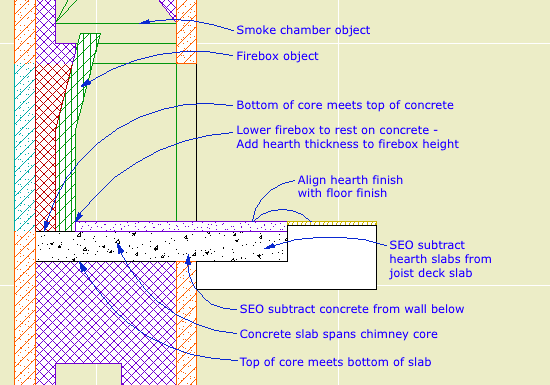
In our true masonry fireplaces, the hearth support is usually a cantilevered concrete slab. The hearth itself is a separate slab with its top at the level of the finish floor, usually 3/4" above story zero.

This finish slab may vary in thickness, and will often be thicker than the typical finish floor. You want to see this slab in plan; put it on A Fireplace or A Cabs2. The concrete slab will be placed directly below the finish slab. It should go on A Chimney3.

Modeling the hearth structure tends to be a construction documents phase task. When you began modeling the chimney in schematics and/or design development, you might have placed the firebox object at project zero, which was OK then. Once you have the real hearth structure in place, however, you need to lower the firebox to meet the structural slab, not the finish hearth. Make sure you add this adjustment to the height of the firebox object, so the top stays put. The polygon wall surrounding the firebox object also needs to be stretched down to meet the slab. (The wall height can be stretched in section, not so much for the object. LAME.)

The structural slab usually extends all the way through the chimney stack. The core portion of the chimney below should be shortened to meet the bottom of the slab.

The other clashes between the hearth slabs and surrounding elements are solved with solid element operations. Both hearth slabs need to be subtracted from the main joist deck, and the concrete slab may need to be subtracted from the non-core wall below.

To be clear, don't move the joist deck to accommodate the hearth; you need it where it is to complete the ceiling of the story below. But the finish floor should be edited to go around the finish hearth. If there's a floor finish fill, it needs to go around too.

Flush hearth structure
Hearth flush with finish floor

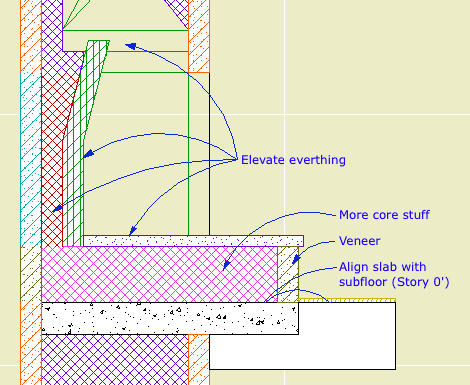
A raised hearth is not much different. The concrete slab will usually be at the level of the joist deck. The finish hearth, the firebox parts, the smoke chamber, and the flue are all raised by whatever distance. You need another slab of core-type stuff, probably CMU, on top of the concrete slab. The front surface of the hearth will be some sort of veneer material, consisting of walls on the A Chimney3 layer.

Chimney hearth structure
Raised hearth

Chimney/Fireplace 1: Fireplace in Plan
Chimney/Fireplace 2: Chimney in Plan and 3D
Chimney/Fireplace 3: Flues
Chimney/Fireplace 5: Chimney Top JM11

Original here.

image
When using the Spread arrangement, Custom First Spacing lets you control the location of the second rafter. After that the regular spacing is used, until the end, assuming End Rafter is on. By tweaking the first space distance, you should be able to 'balance' it with the end space so all the rafters are centered.

image
Quantity parameters for the First and Last rafters allow you to have multiple rafters of those special lengths. For example, exposed rafters in a deep gable end, where the overhang is greater than the rafter spacing.

image
There are Top End parameters for the first and last rafters, so they can differ from the main rafters. Use the Match setting to keep the ends the same.

Here I present an extra-strident version of the usual consistency argument.

Graphisoft should adopt as an unbreakable regulation the idea of a Standard Element. All elements would be required to meet the standard, otherwise they're not elements. Graphisoft would mostly be enforcing this law on themselves, though add-on developers would be bound by it as well. In turn, Graphisoft would have to provide the API tools to create compliant add-ons.

Going forward, new element types created by Graphisoft in future versions would be required to be Standard Elements. There shall be no more situations like 'Here, we have custom profile walls, except they don't curve. Except they don't calculate. Maybe they will some day, be patient, be thankful for what you have.' Except, except, patience, patience.

It should go without saying that all elements can do certain things. When you hear of a new element type in Archicad 12, 13,..., n, curved roofs maybe (hope hope hope), no one should have to say, 'Hey, it has curved roofs. I wonder if the curved roofs will be able to [do some obvious thing that all other elements can do].'

When you add Profiling to the wall tool, it is mandatory that profile walls do everything conventional walls can do. No exceptions. If they can't, then they're not done. Finish them.

The increasing inconsistency among element types makes it harder for the user to 'forget' the program and just work.

I'm not qualified to write such a standard, though I'm willing to start. The important thing is that it exist, and users have a reasonable expectation that it is being followed. Do you think it exists today?

• A Standard Element has complete pens and fills: Section, plan, cover, 3D, overhead. Yes, cover fills for walls, cover fills for beams. Quick, what's the line type for a slab one story down? With truly standard attributes, Edit Selection Set works on all of them.

• A Standard Element interacts with the Floor Plan Cut Plane. (SEO's are another matter, but there's no excuse for conventional wall-roof trims not showing.)

See, standard doesn't mean perfect. We all wish for SEO display in plan, but it's a big step. According to the Standard Element Law, when/if SEO plan display is introduced, it has to work for all elements. None of this 'SEO's show in plan! (Except meshes.)'

• Standard Elements clean up on a by-polygon basis. Element type is irrelevant. Wall corners are irrelevant.

• A Standard Element has complete listing and calculation ability. All global variables are listable. Anything that can be labeled can be listed or scheduled.

• Standard Elements can be grouped. Windows, sections, drawings, I'm looking at you.

• A Standard Element uses polylines. Beams, I'm looking at you.

• A Standard Element can be stretched in various, consistent ways. Columns, I'm looking at your plan symbol. Hey, Marquee, stretch the @#$% objects already.

Pelicans, snakes, whales, people, they're all vertebrates. Below all the special traits, they have fundamentals in common. I want to see an Element Phylum, where certain characteristics are present, without question or thought, simply because the things are elements.

So don't give me curved roofs because I wish for curved roofs. Give them to me because Archicad has curves and Archicad has roofs.

I yield the balance of my time.