On Land

Environment Information
At Rill Architects we run ArchiCAD on macOS. If you work at Rill, this is your stuff. If you don't, but you work in ArchiCAD, you may find something interesting. Anybody else, I don't know.
RSS
Archicad Archive

« Newer | All Entries | 1 | 2 | 3 | 4 | 5 | 6 | 7 | 8 | 9 | 10 | Older »

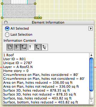
The Element Information palette is accessed at Window -> Palettes -> Element Information. It's a palette; it will hang around until you dismiss it, like Find & Select or the solid elements thing, whatever ridiculous name it has.
Element Information
It gives ID and dimensional data about selected elements. The data is read-only, i.e., not editable. But it's wickedly thorough, maybe even complete. It comes in handy.

There are six sections of data, each activated by one of the buttons. Any or all of the buttons can be active at once. They are:

Properties: ID, layer, and story. This is the only place you can directly read the home story of an element. I don't know why this has to be such a secret.

Size: 2D dimensions. Lengths, widths, and/or 'circumference', which we would expect to be called 'perimeter'. Use fills and this info to do that new/existing comparison the permit people want sometimes.

Area on Plan: 2D Area. Self-explanatory, but note that it's different from the 3D surface area, which is coming up.

Height: Pretty obvious for most things. For roofs, it also gives the perimeter I mean circumference of the top surface. For walls, conventional roof trimming is not considered.

Surfaces: Areas of all the 3D surfaces. Note: Solid Element Ops are taken into account.

Volume: What it says. SEOs work here too. I have actually used this for a back-of-envelope cut/fill grading calculation.

This isn't really calculation, it's just inspection. To actually do anything with the data, besides write it down or copy and paste it, requires list schemes.

Here is the Graphisoft product page.

Here's a short feature list. It reflects my personal biases. Things they are really excited about, I might not even mention!

• PlotMaker is no longer with us. Layouts are part of the project. For large projects, it might be advisable to have the model and layouts in separate files, but they would both be PLNs.

• There is a cutting plane associated with each story, which can be used to automatically display roofs, and other elements, with their true relationship to the current story.

• You can create custom profiles for walls, beams, and columns. I'm not so excited about the beams and columns, since they have no parametrics, but the walls have a lot of potential.

• Interactive Schedules have finally reached version 2. They are greatly improved, and we will use them more and more. Most exciting: Automatic drawing lists.

• PDFs can be placed in layouts.

It is slated for release in the first week of May.

We will not rush into this one. As of this writing, I do not plan on migrating projects. That is, if you started in 9, you should finish in 9. And, I don't have templates for 10 yet. So you can't start new projects in 10 either.

10 is a worthwhile upgrade. But it will be quite different, especially in the documentation area. AC9, and our AC9 methods, are very reliable and not to be abandoned lightly.

Archicad is designed to automatically save project data periodically. In the event of an AC or system crash, project data can usually be recovered. AutoSave is described on page 150 of the AC9 Reference Guide.

More»

Yes, it's a little late for a New in 9 post, but that's what happens when I pretend I'm going to tell you, briefly, anything meaningful about something as gigantic as a rendering engine. After all, it's the sort of thing people write books about.

Said book, by Dwight Atkinson, Canada's funniest Lightworks in Archicad expert, is in the possession of Rill & Decker, or maybe me personally. So if you want to have a look, be my guest.

If you UNCHECK 'Use Cut Elements' Section Pens' in a section's settings, all the cut lines are drawn with one pen, and all the fill patterns are drawn with one pen. The background color becomes clear.

I usually want this box checked, so the distinctive section pens of elements can be seen, which aids model organization and usability. For wall sections, I think there are a couple of advantages to letting the marker set the section pens:

• Model elements can be transparent while fills still have opaque backgrounds. So I can mask stone veneer with a CMU fill, without using two fills. Under the current standard, the Fill Background Color Display Option is set to Transparent, which effects model elements and fills.

• Following from above, the A3 Display Option Combination could be eliminated.

• If you use black (15/11) pens for the section and color pens for added 2D work, it's easier to tell which is which. (Note: Elevation pens are unchanged.)

• I recommend a 5-weight pen for cut lines, unless the element is very thin; e.g., a counter. Using a thinner pen for the section looks better at 1/4" scale, but at 3/4" or 1" it looks weak. With uniform pens, you could have it both ways.

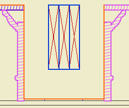
But I don't think we can do it. Certain objects, most prominently Wood Beam JAM9, have clever pen-related section behavior, which the uniform pen feature breaks. This is the wood beam at wall section scale; it knows to draw the X lighter:


But the uniformity heavies up the X along with everything else:


Which is no good, and it really can't be fixed without patches or conversion to drawing, so what's the point. You can always make a line heavier by drawing over it; lighter, not so much.

The technique might be beneficial for interior elevations, since it turns the gray background off. And interior elevations don't show structure members. We should look into it.

Hotlinked Modules are another Big Feature I can't describe fully before moving on to giving you the derivative techniques. There are several English/Hungarian bilingual people whose job it is to fully describe to AC interface so I don't have to. Their efforts can be appreciated starting on page 421 of the reference guide.

Again, I'll just hit the high points.

Hotlinked modules are external project data placed in a project. In the host project they are treated as a single, uneditable group, with hollow, square nodes. They can't be edited directly in the project where they are placed. They have to be opened separately. This is a good occasion for running two copies of AC. Hotlinked modules are one story at a time of solo projects, teamwork projects, or module files. (There is an annoying overlap of meaning between hotlinked modules and .MOD files.) You can place multiple stories of a project, but each is its own module, placed individually.

The default behavior is for AC to check hotlinked modules for changes when the project is opened. You can change this, but don't. You can also do a manual update using the Hotlink Manager. Changes in modules are reflected in the project once the update is complete.

The Hotlink Manager is at File -> Modules and XREFs -> Hotlink Manager. It is here that modules are placed, updated, broken (turned into local, editable elements), and changed.

Breaking a module results in one big group. If you ungroup this group, you will get the groups within, as they were in the original file.

Modules can be mirrored, elevated, and rotated. When a module is rotated, zone stamps and text blocks can rotate themselves to compensate.

Placing a module is completely different from merging a module file. When you merge, the elements become part of the project. Hotlinking is an ongoing external reference.

Only Archicad files can be hotlinked. If you're placing DWGs, you need XREFs.

Applications to follow. Including:

Accessory structure alternates.

Energy calculations.

Showing a rotated garage level on the layout.

Note: Schedules in AC10 are completely different.

In here, where you can't see them, I have drafts of posts. The list of drafts can be viewed as the to-do list for the site. Stuff I know I have to tell you about, but I haven't gotten around to actually doing it. Many of the drafts relate to features of AC that are very powerful and proportionately complex. I don't want to regurgitate the reference guide, but I don't want to merely point you at the reference guide either. So there they sit. Since we're talking about powerful features, naturally there are other drafts of specific tips which have as prerequisites knowledge of the powerful features.

Anyway it's more important that you have the specific tips than the admirably balanced non-regurguitated, non-merely-pointing-you master post. Between the tips and the reference guide, you'll get the big picture. I hope.

One of these features is the Interactive Schedule (IS). We even had a meeting about it, since it's a lot easier to show and tell than to describe in text. I use the IS for door and window schedules, finish schedules, area calculations, and energy calculations. I also use is as a hack Find & Select for parameters within an object, so you can find all the crown elements that use WM-47 and change them to SM-28. Chances are some of these methods interest you, and I think they should, and I've been stalled in documenting them by the intimidating difficulty of the master post, which you'd think from the title would be this one.

So. The IS is documented in the reference guide beginning on page 374. Consider yourself pointed.

The ref guide does OK at telling you what the IS can do, but I think it's still up to me to point out its limitations. It is still very much a 1.0 feature.

• It only works in plan.

• It is modal, that is, you have to dismiss it in order to work in any other window, unlike, e.g., the Find & Select box.

• It can't do math beyond adding a column of numbers. No way to reduce an area by a percentage, e.g.

• The method for sharing schedule settings between projects is pathetic.

• It has too many poor interface quirks to list here.

It does what it does. In the future it will do more, and it's already way more accessible than the rest of the calculate menu.

More to follow.

PS, another big one is Hotlinked Modules. You need those for the energy calc thing I mentioned above. Sigh.

As of, I don't know, 8.1, Display Options can be organized into Combinations, kind of like layers, and Display Options can be saved with views. Our templates have been set up this way for some time, but I don't think I've ever cataloged the combinations. They're just as standardized as anything else. Highly.

In the DO dialog, there are two panes, Display Only and Display & Output.

The Display Only options do not vary among combinations. Real quick: Intersections are on, Walls are contour lines, all the handles are on, section depths, detail boundaries, and markup elements (never used 'em) are hidden.

Display & Output options is where the action is. Rather than describe each combination, or heaven forbid build a table, I'll describe the A1/A2 combination, then how the others differ.

In A1/A2, which gets saved with plans and elevations for output: Beams are Contour Lines (no reference lines), Line Weight is Hairlines (they get turned True in PM), all the Fills are Vectorial, Doors & Windows Show with Dim, Zone Polygons are None, Zone Stamps Show, Section Markers are As in Settings, Column Symbols Show, Fill Background Color is By Element Setting.

Working Plan/SED is the same as A1/A2 except Beams are Entire Beam (ref lines on), and the Drafting and Cover Fills are Bitmap.

A3, which gets saved with wall sections, is the same as A1/A2 except the Fill Background Color is Transparent. (This means no fill backgrounds. Use Solid Fill for white masks. To mask with a pattern fill, you need two overlapping fill elements.)

A4/S0/M/P, which gets saved with RCPs, mechanical, plumbing, and foundation plans, is the same as A1/A2 except the Doors & Windows are Reflected Ceiling.

S, which gets saved with framing plans, is the same as A4/S0/M/P except the Cut Fills are Separators only. This turns the wall fills off, but shows a line at the joint between, e.g., concrete and stone. Fill backgrounds are on, so masking fills will work.

Site, which gets saved with site plans, is the same as A4/S0/M/P except the Cut Fills are No Fills. You will only see the effect of this if you show walls on the site plan.

A quirk of DO Combination management: You can't rename them. You have to Save As, which leaves the old one in place, and then you have to redefine the views that use the renamed combination. Then you can delete the old-named one. Also, I haven't figured out how to import DO combinations from other projects.

UPDATE: Better info here.

Suddenly, Richard's AC could not open a file on the network, and would hang (rainbow ball of death) when attempting to browse a network resource, such as the Hotel. We noticed it when attempting to open another project in Attribute Manager; since the previous state of that Open dialog was viewing the Onion, hang.

All conventional treatments exhausted, I had to call tech support. They directed me to this knowledge base article, which has to with switching off a cross-platform browsing preference that we don't need anyway.

If you ever see this behavior in AC, here's the fix.

Make sure AC is not running. Open Terminal (Applications : Utilities : Terminal). Paste this text into the window and strike enter:

defaults write com.graphisoft.AC\ 9.0.0\ USA\ v1 InputOutput -dict "DisableCrossPlatformMountingFeatures" "<true/>"

That's it. Quit Terminal and relaunch AC.

If you drag a dimension string, the texts will re-center themselves on their segments, assuming the texts have not been moved manually.

You don't actually have to drag the string anywhere, just a drag and a double-click will do it.

The only way a dim text would be off center without you moving it is if you customized the text.

Who cares? You, because you probably changed some texts to read EQ or something, and re-centering them by hand is a cumulative chore.

So, after changing the texts to read whatever, (deselect the texts,) select the string, Cmd+D, clickclick. Note: if the dimension tool is active (very likely), you have to do a Drag command; cursor-drag will edit the witness line length. You can drag with the arrow tool and it works; I think the Cmd+D method is better since you don't have to be precise. Any texts that you moved manually will stay put. AC remembers which those are.

I just dimensioned all the Vassos ceiling lights on the electrical plan, which, if you've never had the pleasure, boils down to a LOT of EQ EQ EQ EQ EQ. So I was really happy with this discovery.

Sort of cross-posted here.

(Originally posted here. Added examples.)

Here is the Geometry Methods info box tile.


Geometry Methods are the ways of making a shape with a tool. The 'GMs' are only available in the info box, not in the settings. You can switch geometry methods in any tool by typing G.

The first button is one click placement. The object will be created with the default X, Y, and rotation. Example: A recessed light fixture, since it's not stretchy and it doesn't matter how it's rotated.

Second is rotated placement. Two clicks. First is anchor point, second is angle. X & Y will be the defaults. Examples: Anything that you would turn to face a certain direction. A lot of things. Sinks. Light switches. Sconces. Centerline symbols.

Third is rectangle placement. Two clicks. First is anchor point. Second is the diagonally opposite point. The same method is available for polygons (slabs, fills, etc.) Not all objects will be placable this way; only stretchy* ones. By this method you can graphically set X & Y, but you can't give values. Example: Crown Tool in coffer mode.

*Interlude: Stretchiness. Objects are stretchy if they have hotspots in their 2D scripts at the 0, A, & B extents, OR "Hotspots on bounding box" is on in their "Details". Don't worry about this now. An example of a stretchy object is Bed 01 in the Furniture folder. The only way to know if an object is stretchy is to try it, or look in the script. Most rectangular objects should be stretchy.

For "stretchy" placement to work, you have to have a corner set as the insertion node in the settings. If a non-stretchy node (e.g., the center) is the insertion node, you get one-click simple placement. In the plan preview window in the object settings, the insertion node has a box around it. You can choose a different insertion node there by clicking on it.

Tip: When you Option-click (pick up settings) on an object, the node you clicked becomes the insertion node.

The fourth button is rotated rectangle. Three clicks. First is the anchor point. Second is angle AND length of first side (X). Third is length of second side (Y). Example: Crown tool coffer in a rotated space. The same method is available for polygons. If a non-stretchy node (e.g., the center) is the insertion node, you get two-click rotated placement.

The key is not to get hung up on "rotated". I use this method all the time for non-rotated polygons, because you can use R to set the length of both sides on the fly. Example: counter slabs. When placing an object such as a bathtub this way, you need to know which way the object goes; X is first, Y is second. If you do it backwards you get the drain on the long side.

If an object is "linear", only stretchable in one direction, stretchy placement still works. If using rotated placement (4th), the second click only sets the angle, and the third click sets the length. Using the fourth button with a linear object enables you to draw it very much like you would a line. Examples: Lots. Drawing title, crown tool in straight mode, steel and wood beams, cut lines. Sometimes it's hard to predict which side of the "line" an object will be drawn; if it's wrong just mirror it.

Choosing the right geometry method saves a lot of after-rotating and -stretching, and is therefore much faster.

I was going to patch up this post, but I decided to do a new one. The old one is mostly right, I just wanted to add...

• In AC9, there is a menu command for Create Independent Detail. That means you can have a shortcut for it. In our keyboard setup, it's Ctrl+D. (What. Oh. Tools menu. Please don't do it that way. I hate menus.) Also nice, when you create an independent detail, it opens automatically.

• For some reason, most of my projects open new independent details at absurdly zoomed-out views. Like the window is a million feet across. I can't fix this, it's not stored in the prefs. It's always a good idea to work near the origin. You can zoom to the origin quickly by placing an object there and then doing a fit it window.

• Wall sections should be Sections. It's so clear to me now.

• IDs. They still need to be unique, but the ID will now take up to 31 characters, so you can be very non-cryptic. You can have spaces, though I don't use them. I like it to be clear that the first word is the ID. To review, use the ID to say what type of detail is in there, with a number so maintain uniqueness. Use the name for a fuller description. Eave1 Typical, Eave2 Shed, Eave3 Porch.

I have been drawing all the engineering details myself, based on their sketches. I keep these separate by beginning all their IDs with "S_".

• Detail markers: For areas, use Detail Area JAM9. For flags, use Detail Flag JAM81. These markers show the ID in Archicad and the drawing/sheet number in PM layouts. For assemblies, use Assembly Marker JAM81. This marker maintains the ID, which is the same as the (non-autotext) drawing number in each assembly detail. It also gives the sheet number, which is automatic. I have developed the habit of putting my schedules and assemblies on sheet A3-1, so they stay put as sheets are added.

• Remember you can open a detail from any marker, not just the original one.

• The biggest hassle with the detail tool is the fact that you can't put a detail marker in a detail window. Maybe someday. If you need to call out a detail within a detail, use an object. Remember the autotext referencing hack.

« Newer | All Entries | 1 | 2 | 3 | 4 | 5 | 6 | 7 | 8 | 9 | 10 | Older »