On Land

Environment Information
At Rill Architects we run Archicad on macOS. If you work at Rill, this is your stuff. If you don't, but you work in Archicad, you may find something interesting. Anybody else, I don't know.
RSS

Object Downloads: Information and Disclaimer

Most parts are customized for the practice of our office. It may be that they are totally not how you would do something. But if they are useful, it's no skin off me for you to try them out. Anything that would be skin-off obviously won't be offered here.

Objects are provided as-is. That said, I'm willing to entertain suggestions for improvements and fixes. If they are easy/valuable improvements or critical fixes, I'll do them. The final arbiter of these matters is, natch, me.

All objects are AC10, unless noted otherwise.

Chances are, attribute defaults (pens, surfaces, etc.) will be way off. You should change the defaults to meet your standards and save the object over if you like.

The 'location' refers to our in-house library structure and won't mean anything to folks on the outside.

All objects are Creative Commons BY-NC unless noted otherwise. Briefly, this means share=OK, alter=OK, but you must give credit and you can't make money. May I ask that if you do wish to pass something along that you give the person a link to this site rather than the thing itself. I like to keep informal track of such things.

If you really like something, drop me a line.

Unless I forgot to put it in, there should be a link to the relevant On Land post in the comment script. In the object settings, click the Comments button (the last one next to the preview window), and then the planet button. Yeah, they took that out. You can still see the URL at least.

Most objects on offer will be to the simpler end of the scale, with few if any macros. If there's a macro involved it will be included in the zip or noted in the post with a link.

Room Name Label JM20

Flag US Etc JM20

Duct Label JM19

Shape Tag and Label JM16

Silo Top JM11

Glass Lines JM11

Battens JM11

Barrel Ceiling JM11

Cutline JM10

Date Text JM9

Niche Cutter JM9

CenterLine Sym JM9

Shape Tag JM9

Slab Elev JM9

Roof Slope JAM9

CenterPoint JAM9

This clever trick from Patrick May at 4dProof about labeling zones in section has two parts. The clever part is the lateral thinking of labeling things in the zones rather than the zone itself. The other part is the introduction of autotexts in labels in Archicad 21.

The lateral thinking part could have been discovered versions ago, you just needed to script the label in GDL because there was no label autotext.

So when I got done slapping my forehead I wrote a label in Archicad 20 which matches our zone stamp and the object we have been using to 'label' rooms in section. And while the label autotext is very handy, but, as always, GDL gives you more power and control.

First, let's review the clever trick. You can't label, or even detect, zones in section or elevation. What you can do is label a model element, and have the label state what zone an element is in. (Related zone condition is determined in plan. The elevation of elements and the height of zones doesn't matter.) Turn the pointer off, and you have a word which is the name of the room floating in the room. The label is live data - if you rename the zone, the section labels will be updated. And, you don't need to know the name of the room to label it.

These element types can report their related zone:
• Object
• Lamp
• Morph
• Beam
• Column
• Stair
• Wall, if zone boundary, with caveats

These element types are ineligible:
• Slab
• Roof
• Shell
• Wall, within zone
• Door
• Window
• Skylight
• Railing (AC21)

To label the room, you need to find an eligible element in it. In our projects, considering that not every room needs to be labeled, almost every room has a lamp, object (moulding, appliance, plumbing fixture, etc), or beam in it. If there are none of these in a room, I suspect the project isn't far enough along to be labeling rooms in section.

The main walls of the room, since they are usually boundary walls, are a good choice with caveats. There may be two (or more) zones related to the wall, so you need to be sure the right one is shown. In Archicad 20, sometimes there are two zones available and the label just ignores one of them. (This seems to be fixed in Archicad 21.) If the walls won't cooperate, you'll need to find something else to label.

Room names in section

The basics described so far also apply to labeling with autotext in Archicad 21. These are the additional features of this scripted label:

It precisely matches our standard for room names, including the fussy underline and the ability to 'stack' two-word names.

It can show the name and the number or both, and the font and size of these texts can be different.

It tries to help if you label something ineligible. If you label an ineligible element, there is no text to display. In this case the autotext label just sits there, blank and invisible. Go ahead, place a bunch of empty labels until you notice the pattern! The scripted label helpfully states 'something is wrong' in this case. (The two things that can be wrong are that the element is of an ineligible type, or it is not inside a zone. GDL doesn't offer the ability to tell these conditions apart, otherwise I would have the label tell you.)

If you are labeling zone boundary walls, you can switch between the two zones the label knows about. (Autotext only offers one zone and no way to switch that I can see.) There is a checkbox in settings for using the 'other' zone, and even better there is a graphical switch at the top of the text block. (It only appears for walls with zone zones.) Switching doesn't always help: Since walls can bound more than two zones, the one you want might not be offered. You'll need to label something else.

Update, July 7, 2017
Only the main properties (name, number, etc) of the zone are available to labels. Our zone stamp has additional parameters, such as an optional short name which can be shown in small rooms. These parameters aren't available to the label, so you can't use the short name for rooms that are small in section. In that case you can make the text size smaller or use the number instead.

I have tweaked the label so it behaves more civilized in the settings dialog.

Download

Location: 32 Exterior Improvements /

Update: Japan and Alaska.

I needed a US flag, and I didn't have my own, so I searched in the settings dialog. The US Archicad Library doesn't have one either. There is one on BIMComponents, written by Graphisoft, and maybe that one is in the international version library. It's just as well, because the object (Flag.gsm) doesn't offer the US design.

In fact, it doesn't name any countries. It is charmingly purely parametric: Choose the number of stripes, their direction, and their surfaces. In this way, they can cover lots of the flags of Europe. There is also a cross option to address Scandinavia. UK? Haha no.

This Graphisoft flag looks really good. It is waving, compound waving even, and it droops just a bit. The code is classic morphbarf, though I wouldn't know how to create such a morph in native Archicad. It was likely done in a proper freeform modeler, imported to a morph, and then saved as an object. Their trick is to slice up the waving flag geometry with CUTPLANEs in various proportions and directions, depending on those non-national parameters, and then apply colors to the slices. So Hungary and France and everyone have different stripes with the exact same waving.

But now we can see why there is no US, UK, or Canada version. The stripes and crosses are all simple straight cuts, and sometimes flags need closed and nested polygons, many of them. When I have to weave together a lot of weird geometry, I head for the group operations, the GDL equivalent of SEOs.

I appropriated the morphbarf and abandoned the rest. (The license on Flag.gsm is Attribution-No Derivatives, but the editor offers limited choices - seems like ShareAlike would be better. Graphisoft please get in touch if you have any concerns.) The operations used are subtraction (SUBGROUP) and intersection (ISECTGROUP). The flag parts' geometries are made via PRISM_, and the trick there is to slope them down to match the droop of the morph. (Tip: (-1) * SIN(droopAngle) * horizontalDistance) Some shapes are subtracted from others, such as the stars in the blue fields. Then each finalized PRISM_ is intersected with the morph geometry, which creates chunks of waving stuff with the different colors.

flags

The leaf translation required some thinking, but I developed a general method that should come in handy again.

In exchange for the morphbarf I am happy to offer the finial and the tapered pole.

As of this writing I have the US (needed), Texas (so simple, and someone might need it), Puerto Rico (requested), and Canada (who doesn't like Canada). Next is probably DC (easy, local) and Alaska (I just like that one). Japan? Having done the maple leaf, I can see the UK from here, which would lead to AUS and NZ. Anything with a fancy seal or heraldry (Mexico, half the US states) will require different techniques. Staying away from Maryland for now.

Download here.

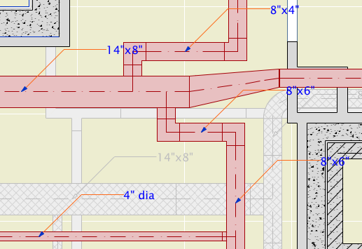
This is a very simple label for duct elements made with the MEP Modeler add-on. It's intended for use with any simple duct type, including Straight, Bend, Take-off, and the Obstruction Fittings (as far as I can tell). I'm using it solely for straight pieces, since no one is fabricating anything from my plans - I just want to coordinate with the HVAC engineer.

For round ducts, the label reads '5" dia'. For rectangular ducts, it reads 'Width x Depth'.

All our ducts are sized in inches, so I'm using a fractional inch format for the dimensions. On the off chance that someone else might find this label useful, I've added a parameter so you can choose to have the label's format match the current dimensions format in the project preferences.

It was convenient to use Select All for the (straight) Duct Tool, then label them all with the Label Selected Elements command (Document -> Document Extras).

Duct Labels

Download

Location: 01 General / 1 Graphic Symbols

Shape Tag
A shape with a text block in it. While working on the labels in 19 post, I realized I had never posted the recent updates or the label version.

The shapes are square, rectangle, triangle, circle, ellipse, oval, diamond, hexagon, pointed box, and roundrect. The roundrect has authentic iOS proportions.

The rectangle, oval, hexagon, and roundrect will elongate to accommodate the text, if the Stretch for Text parameter is on. The square will turn into a rectangle.

The Height parameter refers to the vertical dimension. The Length Factor parameter is multiplied by the height to get the length of the rectangle, ellipse, oval, and roundrect shapes. If Stretch for Text is on, the length is overridden by the text length.

The text, by default, is the global ID of the object. You can also choose to enter a custom text.

The size of the text can be set by points, millimeters, or as a fraction of the shape height. All these parameters are hooked together, so when you switch among them the actual height stays the same.

There is a value list for the font, and you can enter any font name. The text can be shown bold, italic, underlined, or any combination.

The Mask parameter will make the shape opaque white, using the 'Solid' Fill and White Pen parameters.

The Shape Label is simply a label version of the same thing. When placed as an associated label, the ID displayed is that of the labeled element. Placed independently, you need custom text.

Download here.

Silo Top
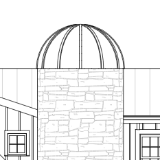
Since I've needed a silo top object one time in ten years, there's a chance that among a group of people larger than just me someone will need a silo top object at least one time in the next ten.

Download (AC11)

Glass Lines
Location: 01 General / 1 Graphic Symbols

Another one for the well-under-4KB* series...

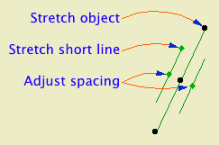
The length of the object is the length of the long line. The length of the short line is set by the Short Line Factor parameter. You can adjust this factor graphically. The spacing of the lines is controlled by the Spacing parameter. Also graphi-justable.

This is a good one to place with the rotate and stretch geometry method (fourth button). With this method I had an intermittent glitchy behavior where the object would appear offset from my clicks, but I couldn't reproduce it.

I wanted to add this symbol to our doors and windows directly, but I don't think it's possible to force the lines to tilt rightward in every case, once you factor in the orientation of the door and the viewpoint and all that.

Download (AC11)

* Until you add the preview image.

Location: 06 Wood & Plastic / Trim & Moulding

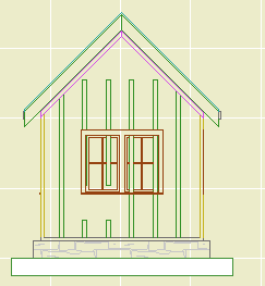
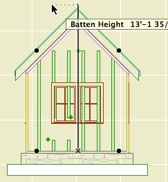
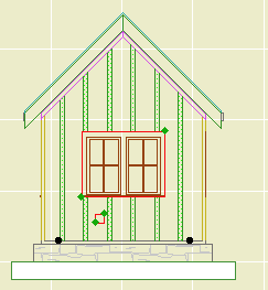
A series of battens for board and batten siding. There are parameters for Width, Thickness, and Spacing. For a single batten, set the spacing to zero.

In order that you can do a whole wall with one Battens object, you can have up to eight Holes in the batten arrangement. Turn on as many holes as you need and fit them to the windows and doors. You can do this in section or elevation using the editing hotspots.

Battens 1
This is an excellent throw-down-and-fix situation. I placed the object along the wall in plan. Now I can fine tune it in elevation. Note the gap in those two battens; that's one hole.

Battens 2
You can stretch the height using the editing node at the center of the top. The ordinary nodes at the ends won't work, don't ask me why.

Use solid ops to trim the battens to the roofs.

Battens 3
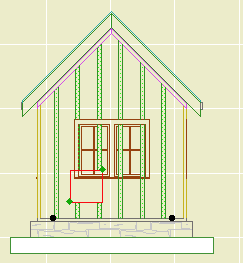
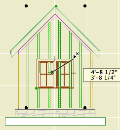
Each hole has two editing nodes. The lower one moves the hole, and the upper one stretches its height and width. The red box shown here is optional; turn on the Show Holes parameter if it makes it easier. You can still edit the hole if the box is not shown.

Battens 4
Position the hole first, then stretch it. In most cases, you'll do this by detecting the intersections at the casing corners.

Battens 5
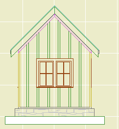
So that's that.

Battens 6
If you need another hole, turn it on by increasing the Holes parameter. By default, additional holes will appear at a small size at the bottom of the object.

Battens 7
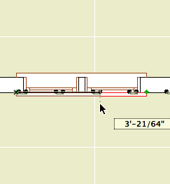
With Show Holes on, the holes are also visible in plan. But to align the holes precisely (not to mention vertically), you need to work in section or elevation. Hole editing will also work in the 3D window, but you won't be able to snap to the casings very effectively.

Download (AC11)

Location: 13 Special Construction

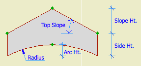
For modeling a vaulted ceiling under a flat ceiling or a gable roof.

Barrel ceiling section
Heights are editable in 3D and section.

Turn on the Ellipse parameter for an elliptical curve. Other wise it's a simple arc.

With the Model View Options in 'ceiling mode', the object can use the optional ceiling pen, linetype, and cover fill. (Use the layer F Trim Crown, which shows in RCP and section/elevation combinations.)

Barrel ceiling in RCP

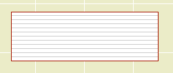
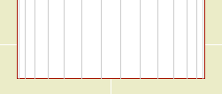
The Arc Lines option will draw lines with variable spacing to illustrate the curve:

Barrel ceiling arc lines

You can use the arc lines as a 2D-only symbol by turning the Model parameter off.

Download (Requires Slope macro)

Location: 01 General / 1 Graphic Symbols

UPDATE: Backsaved version for AC9.

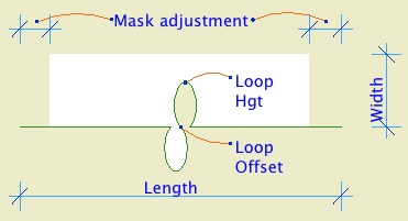
Same features as the AC9 version, with a simplified interaction for getting the loop off center.

Cutline JM10

More»

Date Formats
Options
Location: 01 General / 1 Graphic Symbols

A text object for writing the date.

If Auto Update is on, the date will be read from the system. (Tip: turn it on and then off to get today's date while keeping it from updating by itself tomorrow.) The Year, Month, and Day can be set manually using the pulldowns.

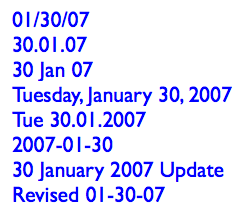
There are a lot of Date Format options. I've tried to cover all the conventions that I know of.

Any of the formats with a separator character will use the character given in Date Separator. You can choose from the list or make something up.

Two-Digit Day will zero-pad single digit days.

Day of Week can be on or off. If it's on, it will be read automatically along with the rest of the Auto Update. It will not fix itself for a manually set date. (It doesn't know the 30th is a Tuesday.) The Format of the day of the week can be long or short. Note that the list will always give the short form. The day of the week can be followed by an arbitrary separator, where the default is a comma.

You can add Leading or Trailing Text.

Text Formatting: All the usual suspects. Font, size. (You can choose mm or points to define the units.) Bold, italic, underline. The object can be anchored by any of the nine typical text block spots, using the Horizontal and Vertical Anchor parameters. You can have a Background Pen and the Outline Pen. Setting either one to zero turns it off. Finally, you can set the Padding between the text and the background/outline polygon. (This uses the same units option as the text size.)

Non-locals who would like to try it out can download it here.

Niche
Location: 13 Special Construction

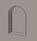
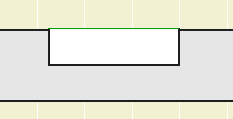
A rectangular or arched shape for subtracting niches into walls.

If the Arch Height is zero, the top is flat. The Wall Pen draws a heavy line around the back of the niche, to match the weight of the wall's contour.

The side with the center node should go along the edge of the wall. That side is drawn with the object's pen.

The idea is to SEO subtract the object from the wall, as discussed here. You can use a window to cut a niche, but the subtraction gives you better display control.

You would typically place the object on the layer X SEO Show2. This is the layer for SEO operators that show in plan only. (In 3D views, you would see the niche, but not the operator itself.)

You might need to bring the object forward to make sure it masks the wall. The parameter Edge Nudge helps make sure the lighter edge line of the object covers the heavier wall contour line underneath. Turn on True Line Weights to check it, and increase the nudge as needed.

Niche cutter plan

Download (AC10)

image

Location: 01 General / 1 Graphic Symbols

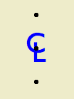
If you're local (in the same room), this won't make much difference to you. I have generalized the old CL symbol so I can offer it for download on the new Archicad Talk Object Depository. This means I'm enabling flexibility which I, and the locals, don't need.

For everyone else. This is your basic CL symbol, since most fonts don't have it. You can change the font and size, and apply bold formatting. Now I'll copy and paste the helpful commenting from the 2D script:

!! The default font is Arial, since that
!! seems to be the default font of the
!! universe. If you have Gill Sans, use
!! that. It looks best IMO. It's the font
!! in the preview image. Full disclosure:
!! I'm not into the faux-hand lettering
!! thing.

!! If you put in a custom font, and you're
!! graphically particular, you might need to
!! adjust the Text Offsets to get the right look.

!! The top & bottom hotspot offset is
!! proportional to the point size. I don't
!! know what happens with very large sizes;
!! you might need to adjust 'spotY' as well.
!! Personally, I never mess with the size; I just
!! put it in for completeness.

!! Why aren't the offsets parameterized?
!! Because you shouldn't change them for
!! specific instances. They should be standards
!! that are invisible in regular use.

Placement tip: Set the object to insert by the top or bottom hotspot, and use the Rotated geometry method of the object tool.

Download (AC9)

Location: 01 General / 1 Graphic Symbols

Shape Tag
A shape with a text block in it. The old version was called 'Character+Shape'; it only had a few shapes.

This one has square, rectangle, triangle, circle, ellipse, oval, diamond, and hexagon.

The rectangle, oval, and hexagon will elongate to accommodate the text, if the Stretch for Text parameter is on. The square will turn into a rectangle.

The Height parameter refers to the vertical dimension. The Length Factor parameter is multiplied by the height to get the length of the rectangle, ellipse, and oval shapes. If Stretch for Text is on, the length is overridden by the text length.

The text, by default, is the global ID of the object. You can also choose to enter a custom text.

The size of the text can be set by points, millimeters, or as a fraction of the shape height. All these parameters are hooked together, so when you switch among them the actual height stays the same.

There is a value list for the font, and you can enter any font name. The text can be shown bold, italic, underlined, or any combination.

Update 2007-12-13: The Mask parameter will make the shape opaque white, using the 'Solid' Fill and White Pen parameters.

I'm making this object available for download on Archicad-Talk. (Hence the mm size option.)

Or download here.

A label to show the elevation of the top or bottom of a slab.

It works in plan or in section, and changes its form depending on which kind of window it's in. It can give the elevation to project zero or the home story of the slab.

I made it in an attempt to overcome one of the big limitations of the Level Dimension tool: It can't read the bottom of an element. If you can read the bottom of an element, you can show live ceiling height dimensions in the RCP. I'm also attempting to overcome one of the big limitations of the level version of the regular dimension tool in section: It isn't truly associative and doesn't move when the slab does.

In creating this label, I discovered and did mortal combat with several disabilities in Archicad, and especially in the label functionality. In the end, it doesn't do nearly what I want it to, but it's (mostly) not my fault. The section version works well for showing ceiling heights, as long as the slab is on the same story as the room. To use the plan version in RCP, my original primary goal, involves additional layers, or commits me to fussier modeling of ceilings than is otherwise needed, and is tedious to maintain.

(I wrote a mini-white-paper mapping the related Archicad disabilities on Archicad Talk, if you're interested, here it is.)

So even though the plan version has three broken legs, the section version is passable, so here it is.

Use it as an associated label, of course. Choose to label the top or bottom, to project zero or the home story zero.

In plan, you should only use it to label the bottom of a slab; for the top, the level dim is far superior, since it can read hidden elements.

The plan text can moved anywhere, and will flip around depending on what quadrant it's in. Sorry about the separate X & Y editing hotspots, for some reason they can't coincide in labels. I regrouped and got it working; the current version is for AC10 or above.

When placing the label in section, it will always appear at the lower left corner of the slab. If you are dimensioning the top, you need to move the label manually.

Download (AC10)

Location: 01 General / 1 Graphic Symbols

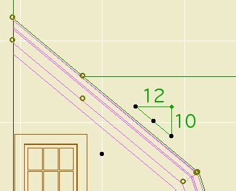
Just like Slope Symbol JAM8, except it's a label. Used as associated label on a roof, it will convert the slope to n/12 and draw the triangle correctly. This symbol is typically used in section and elevation, but I could see using it in the roof plan.

Select the roof you want to label and check 'Label Elements' in the Info Box.

(To set the label tool to use this label on roofs, go to the default settings of the label tool, highlight Roof Tool in the top panel, and select Roof Slope JAM9 from the flyout.)

After activating the label, you will have to move it into position. Make sure "Use Symbol Arrow" is checked in the Info Box. This keeps the leader from being drawn.

To label a roof which slopes in the other direction, switch the "Mirror" parameter to On. Conventional mirroring doesn't work.


You can stretch the length using the green node.

The hypotenuse is optional for outsiders. In our standards it is on.

Download

See Also: Labels

Centerpoint
Location: 01 General : 3 Drawing Tools

Basically a hotspot. Why not just use a hotspot? Since it's an object, you can show it on all stories, ensuring that the centers stack, and move together.

Also the astronomical symbol for Earth, if you ever need that.

Download (AC9)